A Snack in Stripes and Colour.
Client
Toniutti
Work
Brand Identity
Services
- Brand Strategy
- Creative Direction
- Art Direction
- Naming
- Visual Identity
- Graphic Design
- Photography
- Web Design
- Web Development
Challenge
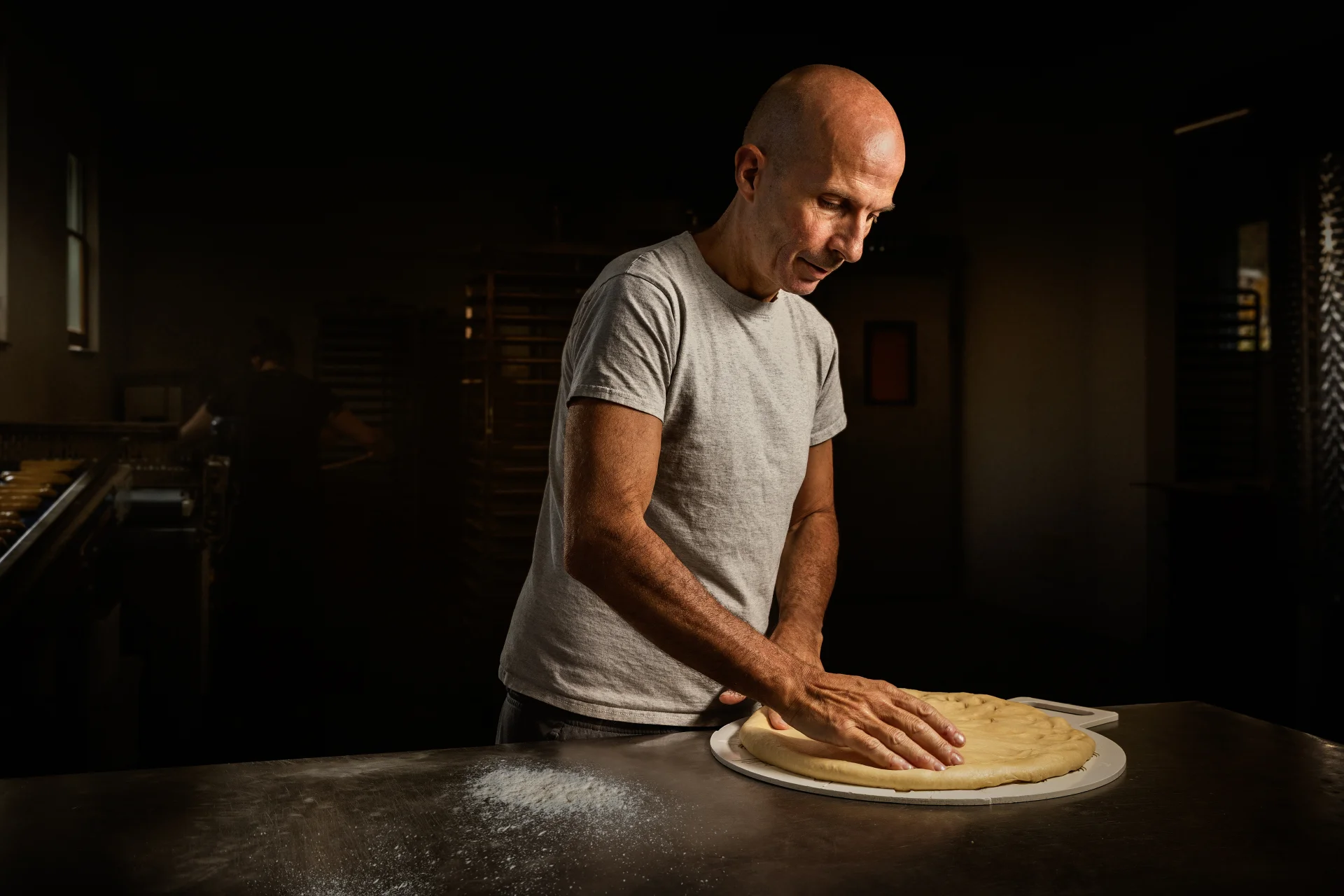
Toniutti is an artisan bakery with a vision: a line of breadsticks that brings the craft of the bakehouse together with the ease of a snack. When the studio was first approached, the product had yet to reach the market and the brief was limited to the graphics for the bags. Yet this early stage held a far greater opportunity: to build an identity ahead of launch, rather than simply dress a product in a graphic skin. Artisanal by nature, the line would sit alongside other bakery products, not on the shelves of large-scale retail, a setting where packaging speaks a largely shared visual language and products struggle to tell themselves apart. Hence Toniutti's ambition: to give its line a presence able to rise clearly above the competition.
Thinking
Our analysis of the market, spanning direct competitors and large-scale retail, revealed a strikingly uniform picture: the artisan category speaks a repetitive, low-end visual language that undermines the perceived value of genuinely good products. Working with the client, the real heart of the project surfaced early on: to stand apart, the line needed a complete brand, not simply a package. The direction we set was to position Toniutti among artisan products with a premium aesthetic, while keeping a lightness true to its nature as a snack. Our research focused on Italian food packaging of the last century, with Art Deco as the reference that gives tradition its roots. Overly modern solutions were set aside, as they felt contrived and lacked a credible story. The work thus had to resolve a double tension: artisan versus snack, tradition versus contemporary.
Outcome
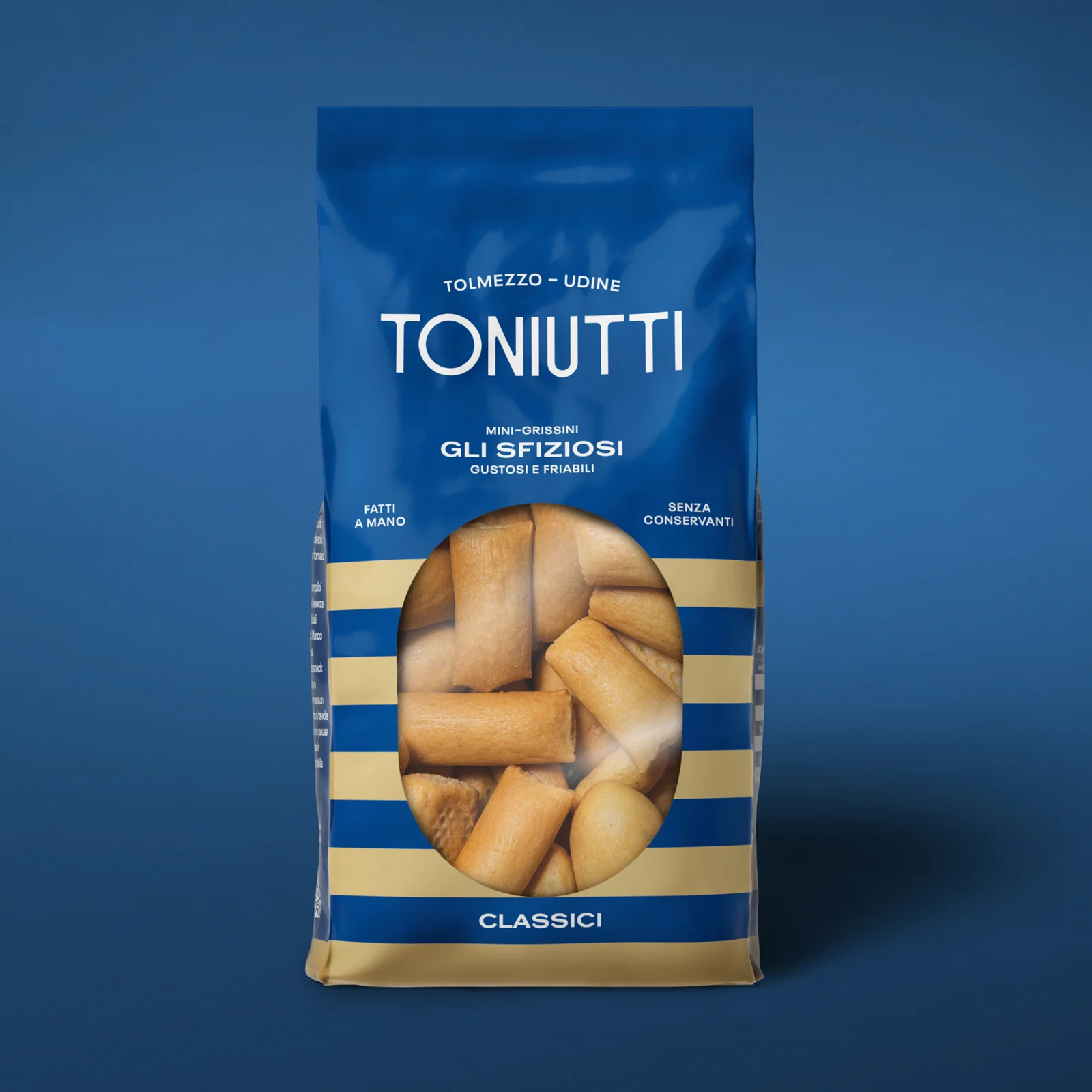
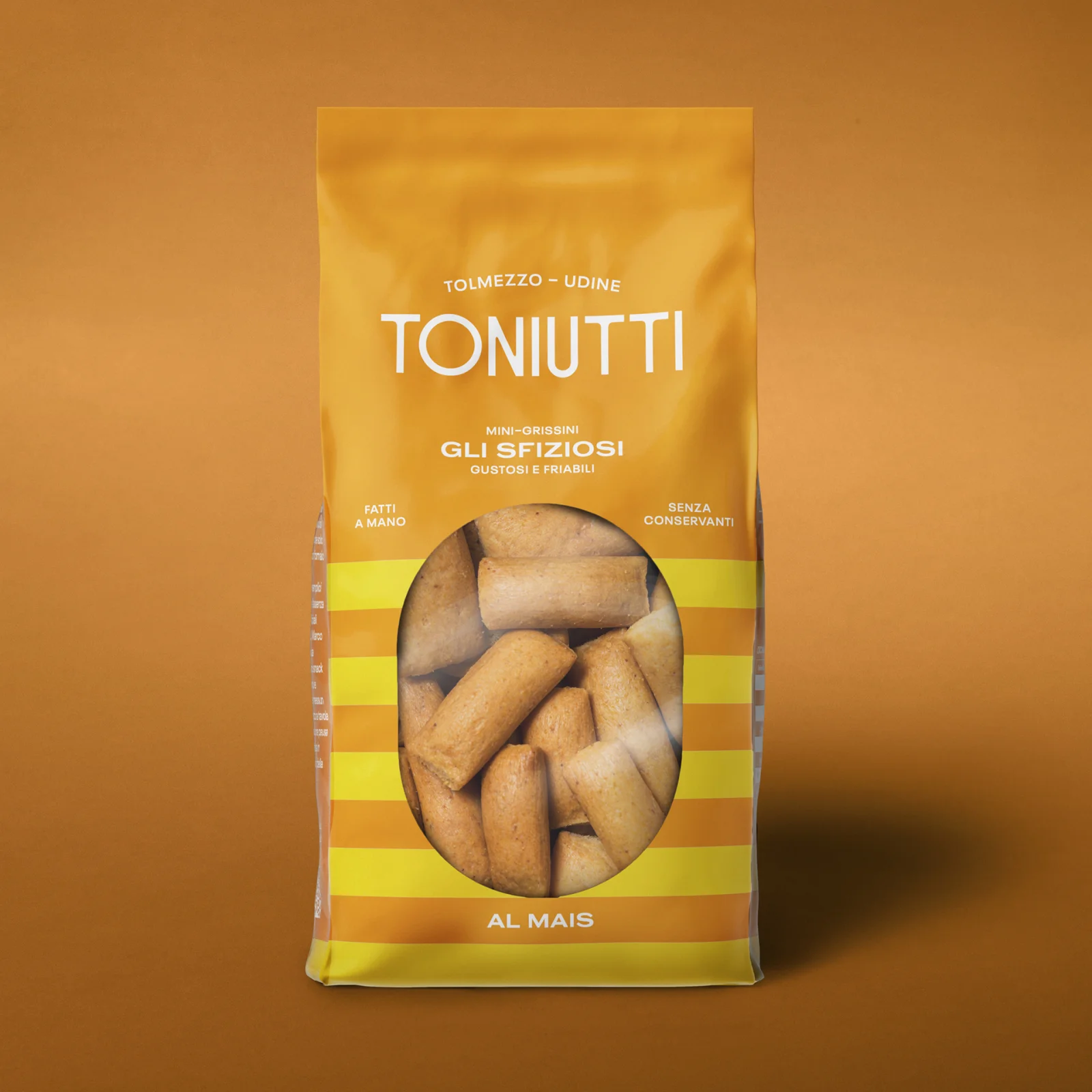
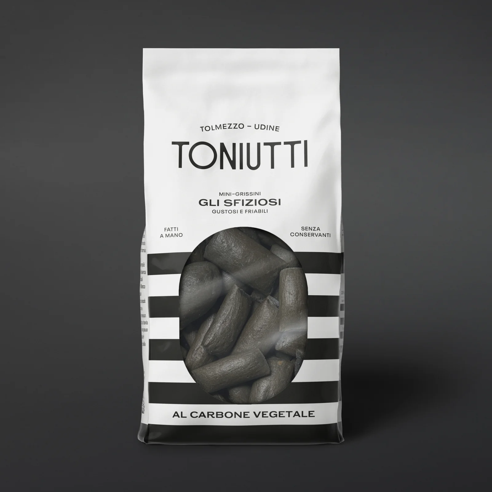
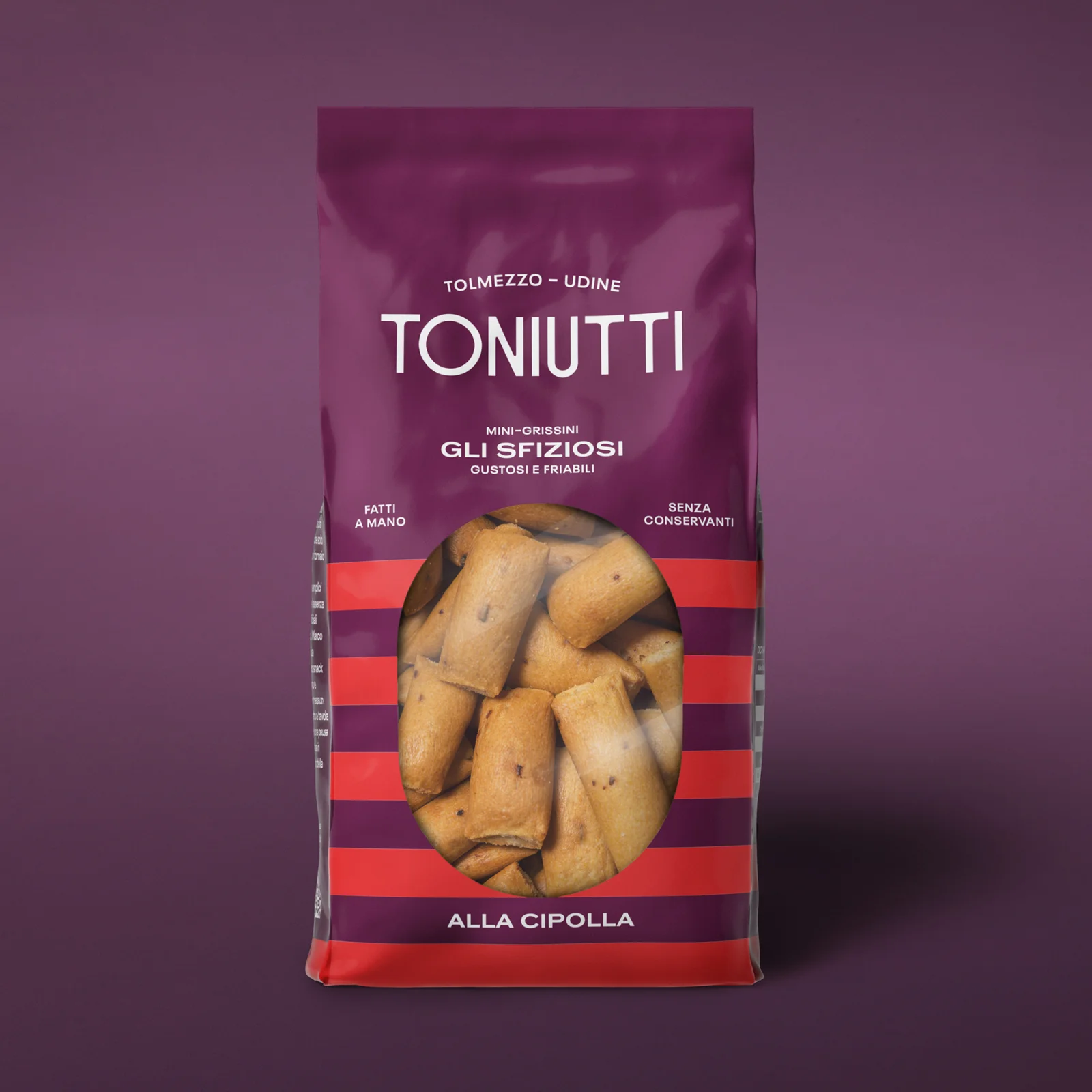
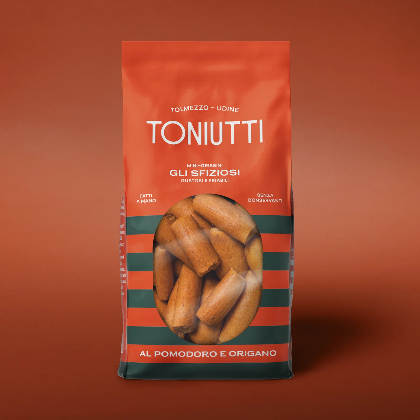
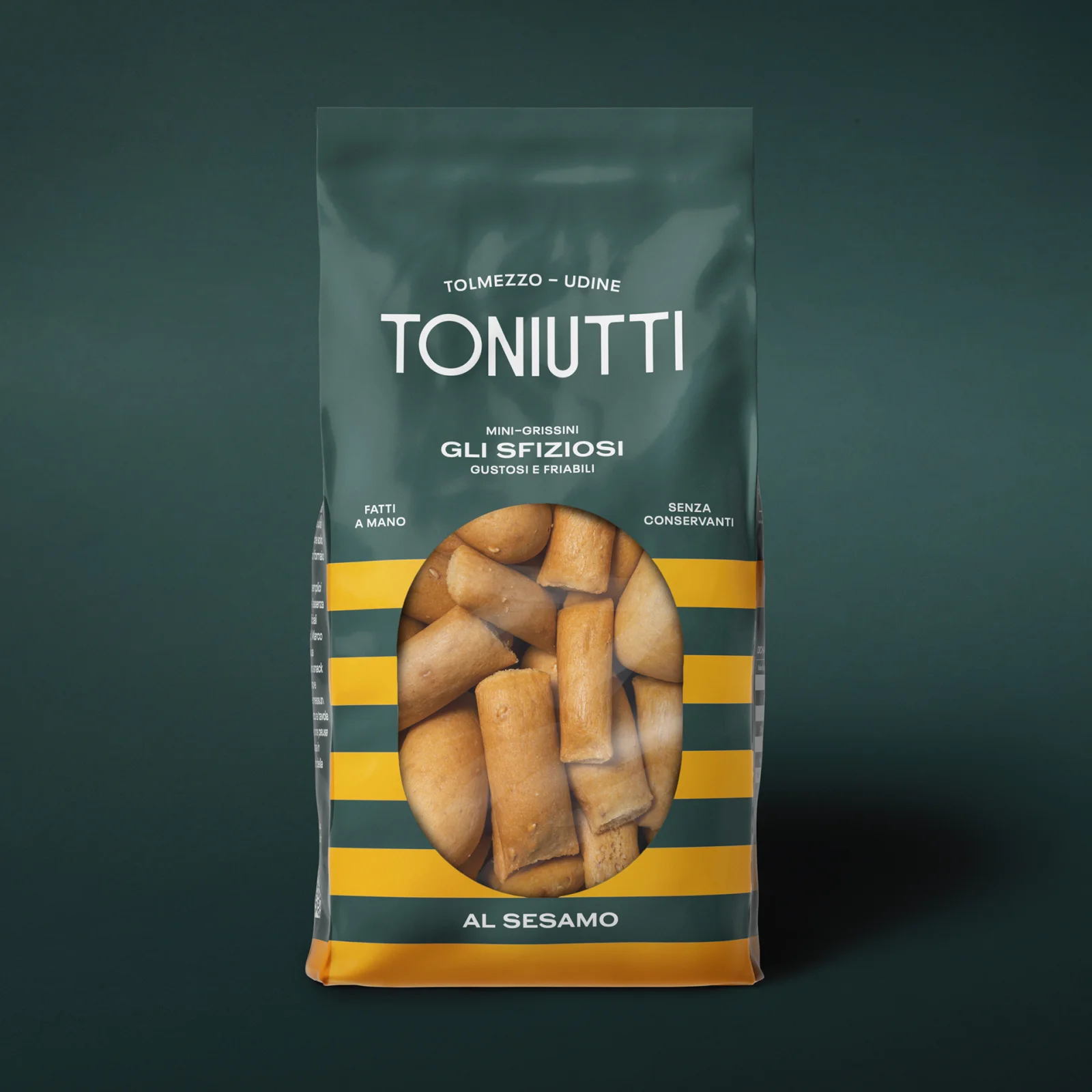
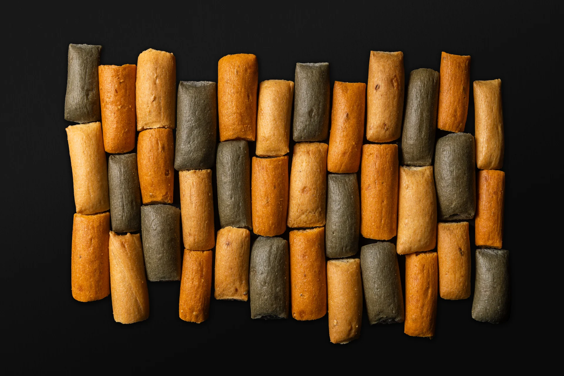
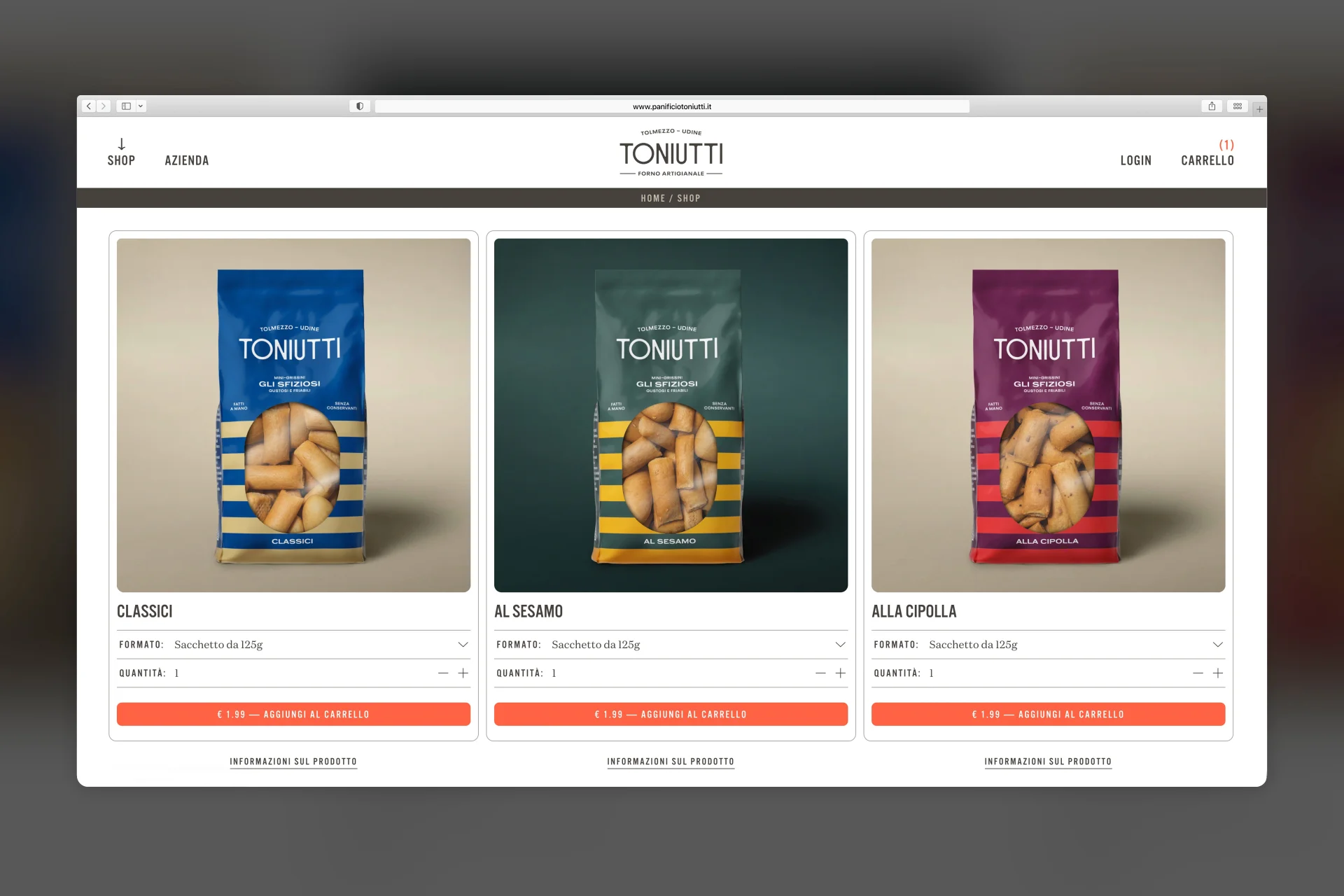
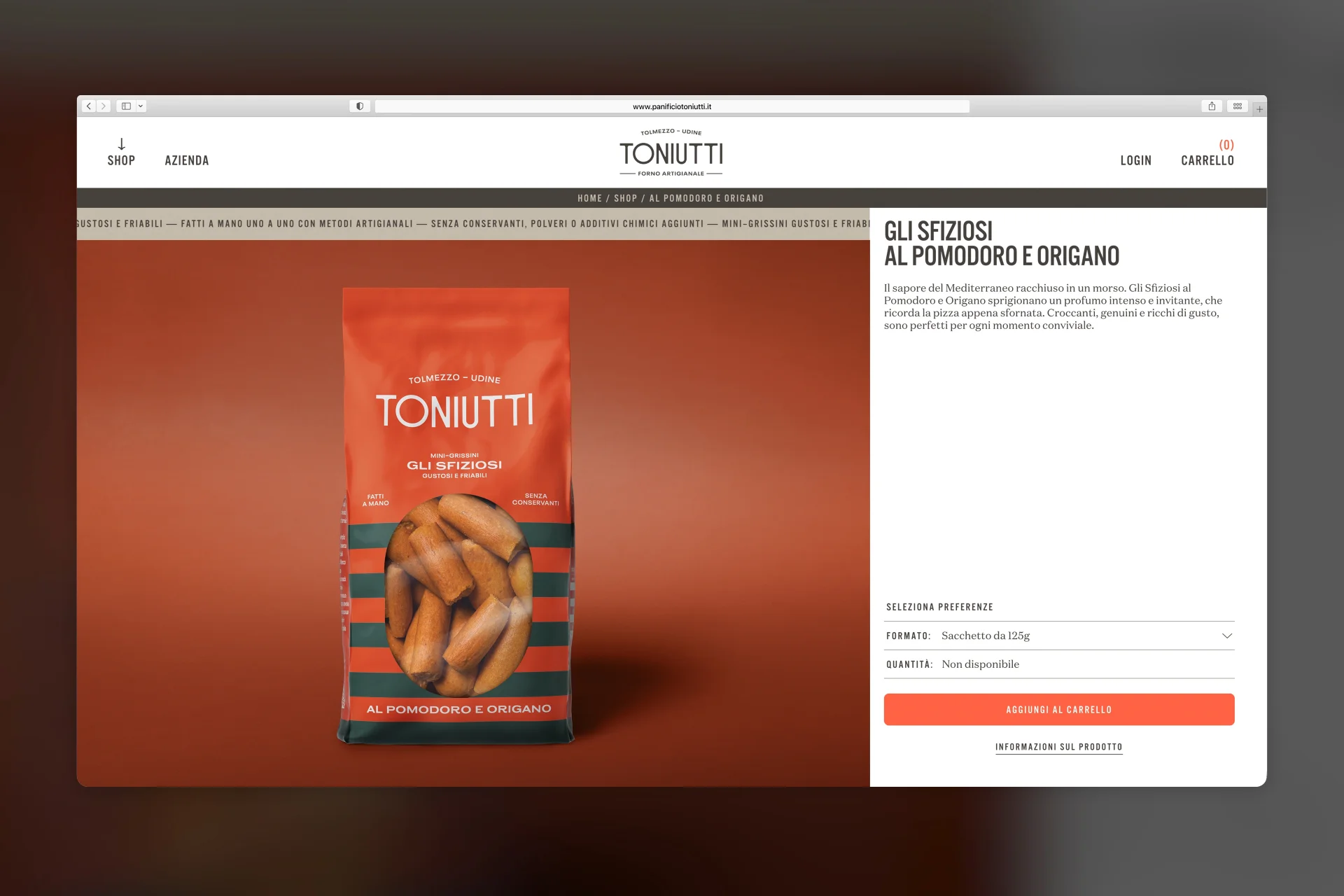
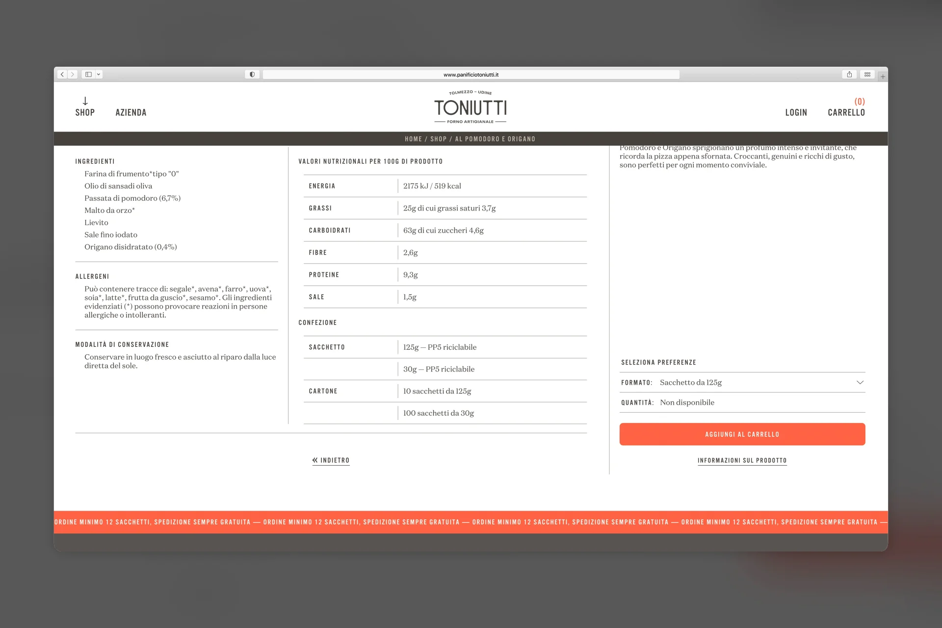
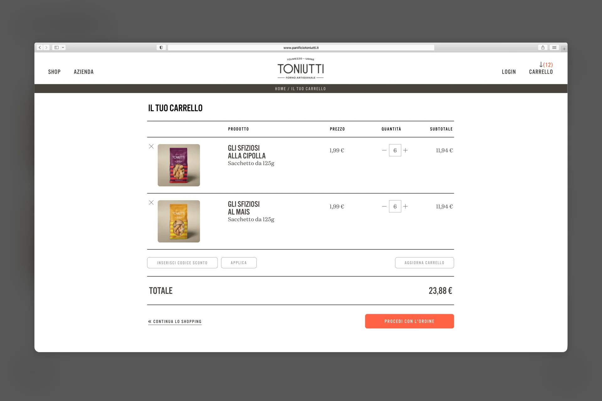
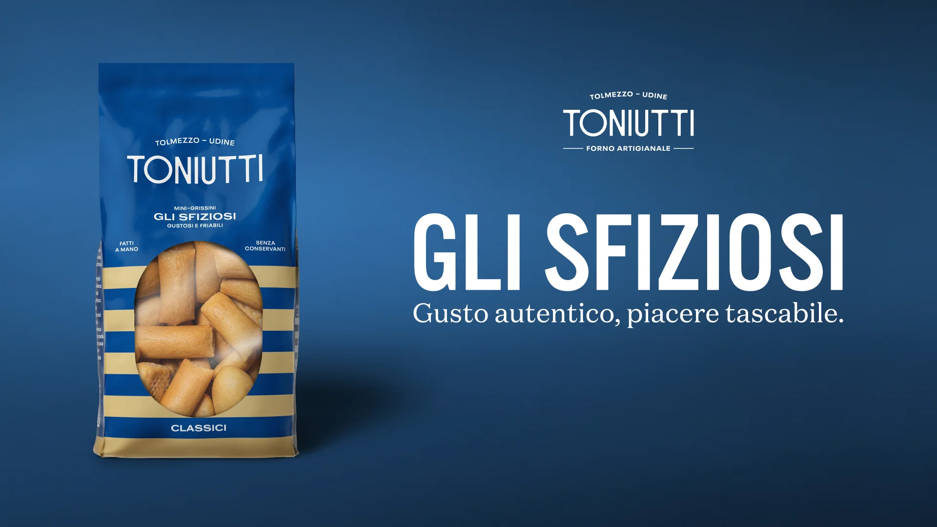
We gave the product a name, Gli Sfiziosi, that distils into two words the lightness of a snack and the pleasure of tasting. On this foundation we built a complete brand system: visual identity, packaging, art direction, image production and a website with e-commerce. The packaging is its most immediate expression, resting on a deliberately essential framework: a solid-colour background, stripes in a second colour and a restrained, neutral typeface. The layout, identical across the entire range, lends the line its coherence, while colour tells one flavour from the next. Vivid hues and varied colour pairings, drawing on the Art Deco that emerged from our research, carry tradition into a contemporary language and make the line recognisable at a glance on the shelf.
Impact
The new brand system has lifted Toniutti out of the conventional artisan category and into a premium territory where the product stands out at first sight. This positioning has raised the perceived value of the line and, with it, its shelf price, to the benefit of the producer's margins. The clarity of the message and the strength of the identity have made Gli Sfiziosi easier to sell and opened a smoother dialogue with new distributors, who find in the brand a proposition that is already defined and instantly recognisable.