Delivering home fitness with style.
Client
Gymsi
Work
Corporate Identity
Services
- Art Direction
- Visual Identity
- Logo Design
- Editorial Design
- Web Design
- Verbal Identity
Challenge
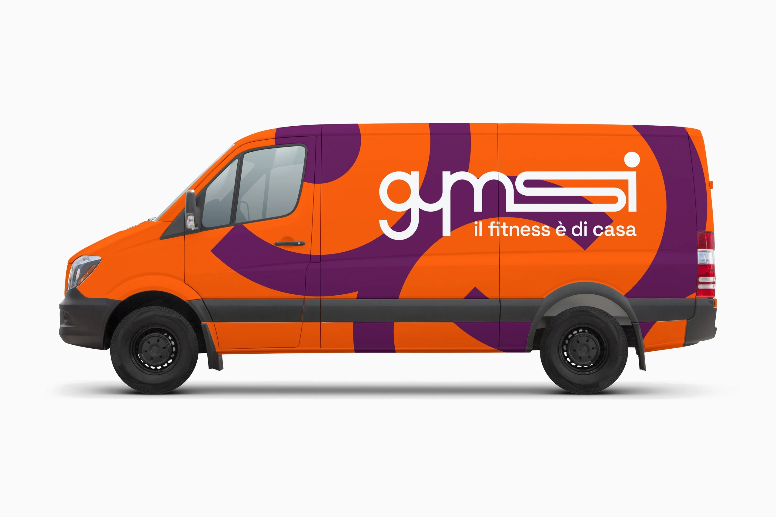
Gymsi is an innovative home-fitness start-up rethinking the way people stay in shape. Fully equipped vans bring personal trainers directly to clients' homes or to pre-arranged outdoor locations, delivering maximum convenience and flexibility. This distinctive approach guarantees availability at all times and adapts to even the busiest schedules, letting people train wherever and whenever suits them best. The brief called for a brand identity built around Gymsi's young, energetic and approachable spirit.
Thinking
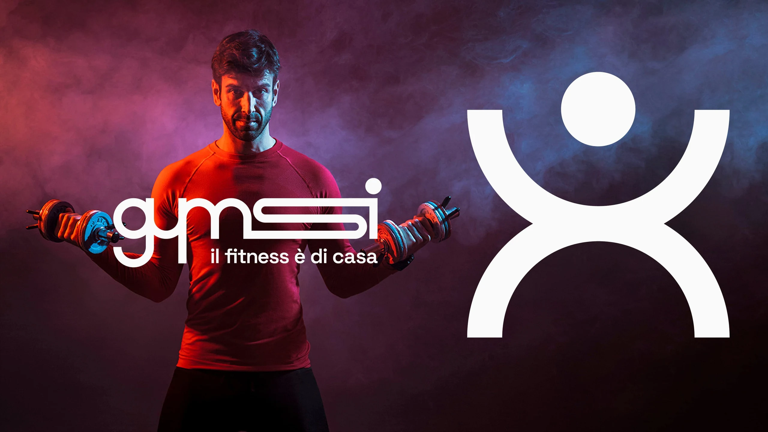
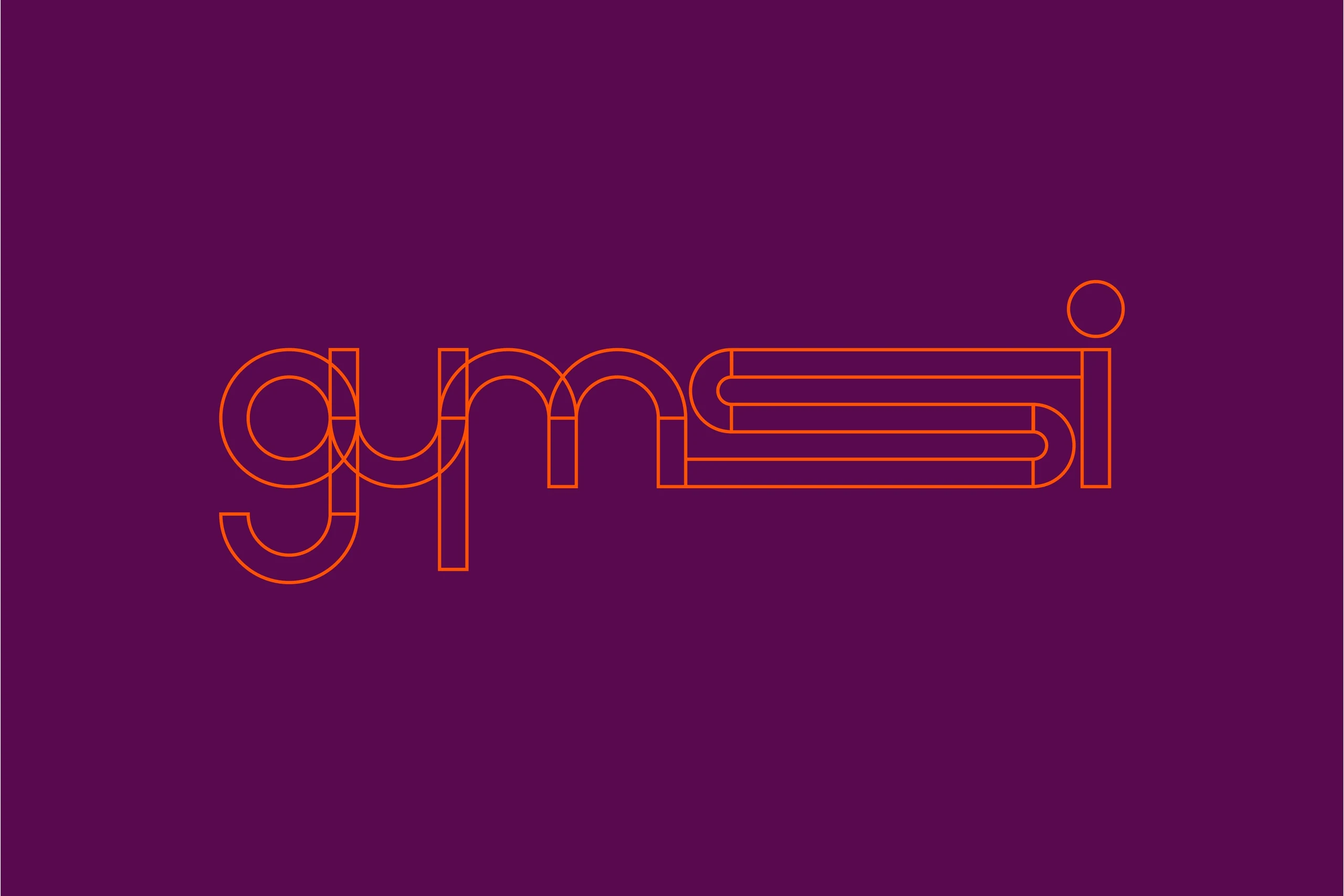
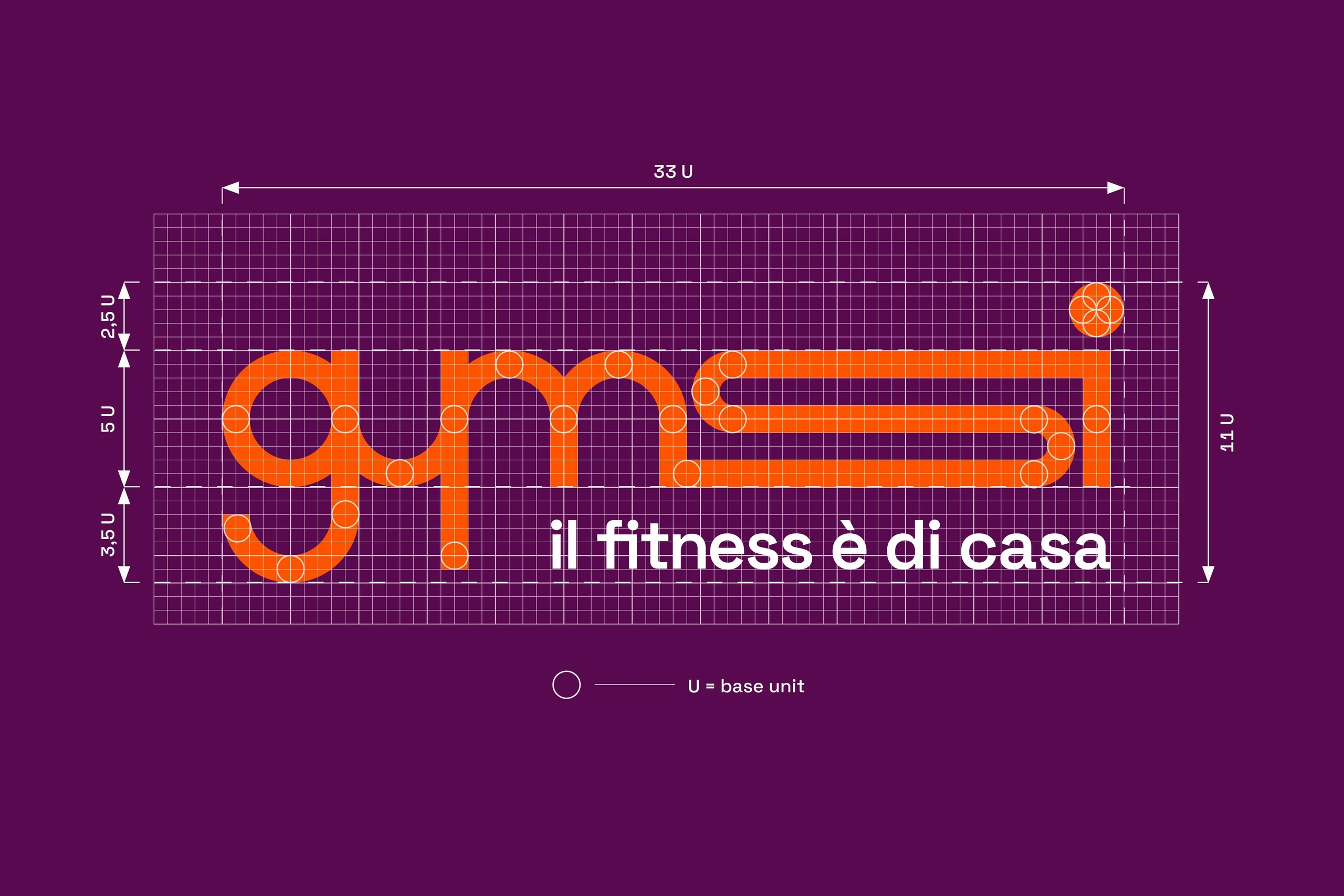
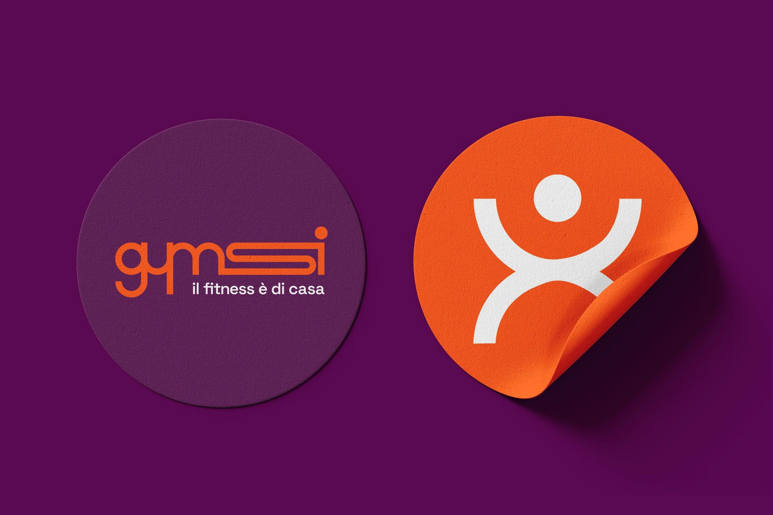
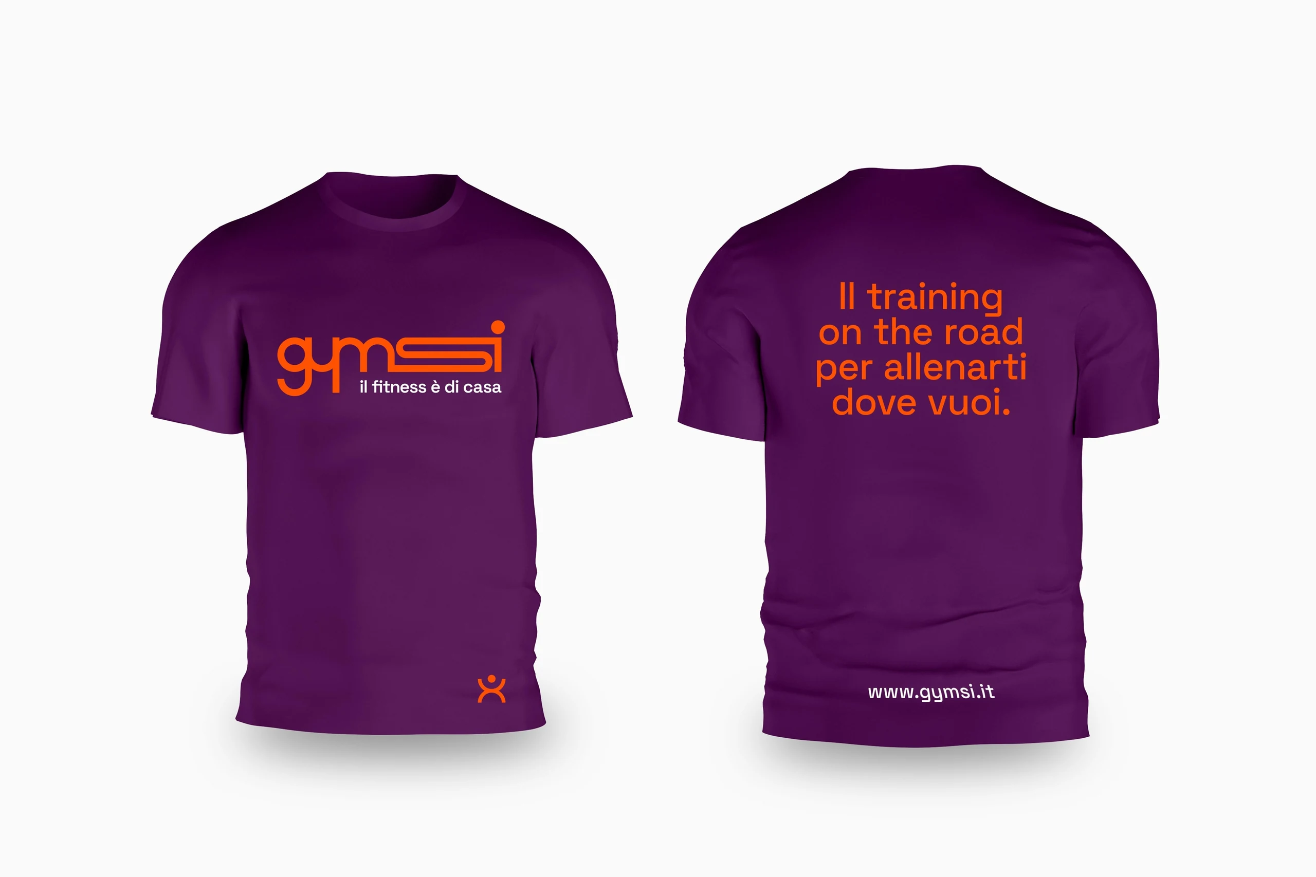
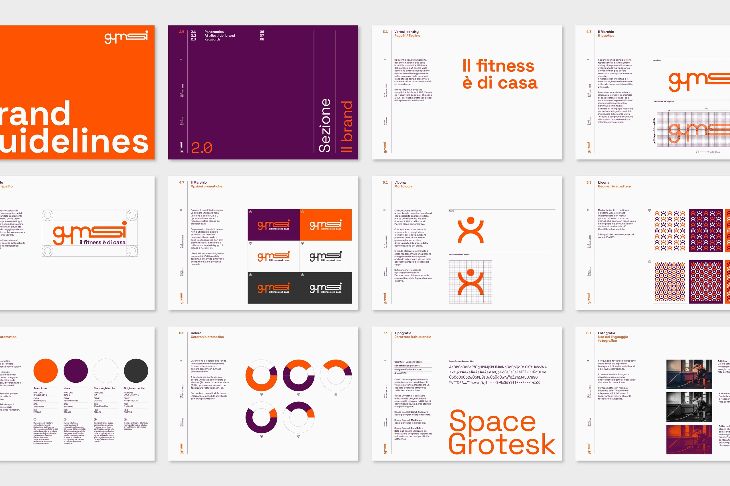
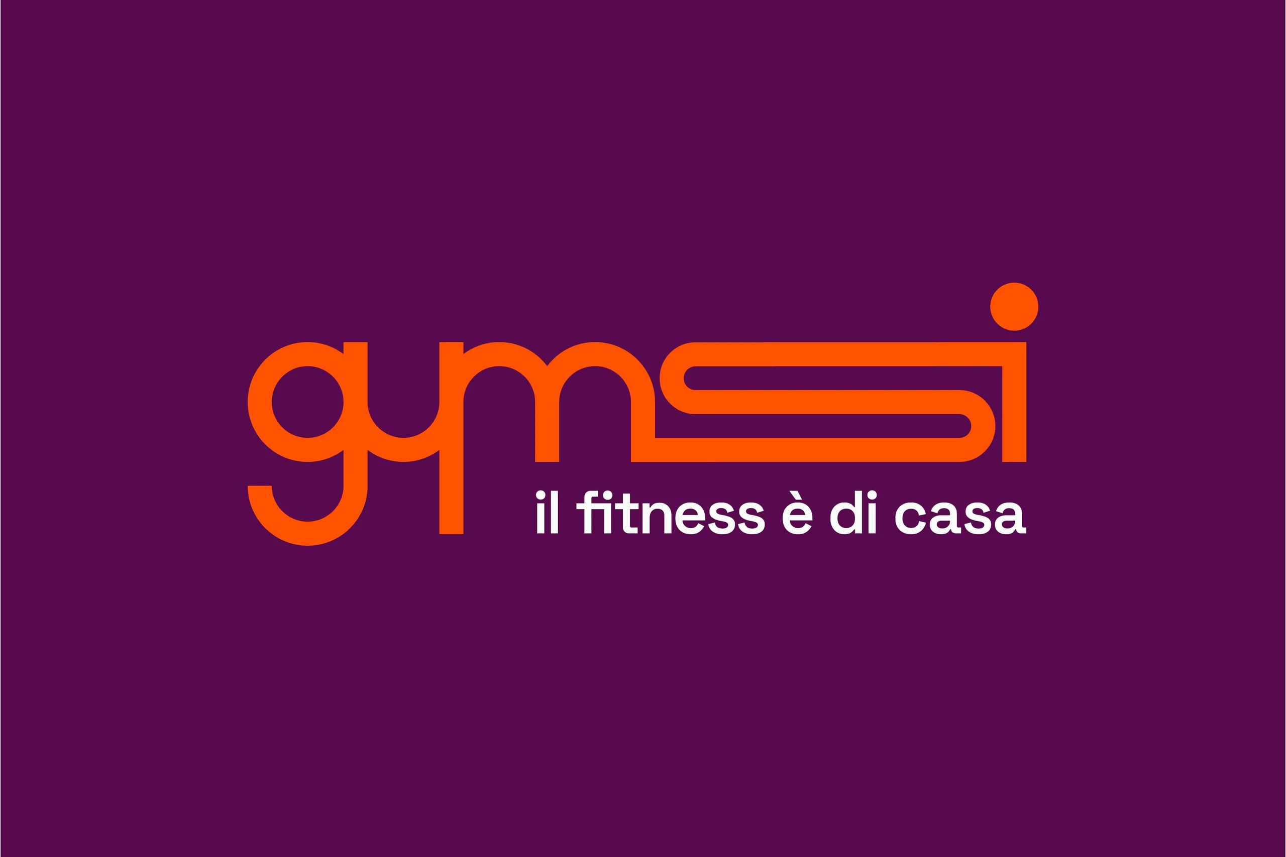
The concept grew out of movement, energy and flexibility — the values driving Gymsi's entire proposition, one that takes training outside the traditional gym to fit people's own time and space. This dynamic tension found its visual expression in the logotype's "S," elongated and fluid, chosen as the brand's core sign. Line and circle became the geometric grammar underpinning the whole communication system, from the logotype through to every visual application. The icon follows the same principle: a stylised, minimal figure with open arms and legs, evoking the gestures of physical exercise while drawing on the same construction elements as the logotype. The payoff "il fitness è di casa" follows this same logic of synthesis, playing on a deliberate ambiguity in Italian — read at once as a plain description of the service, bringing the gym to people's homes, and as a metaphor for professionalism and expertise.
Outcome
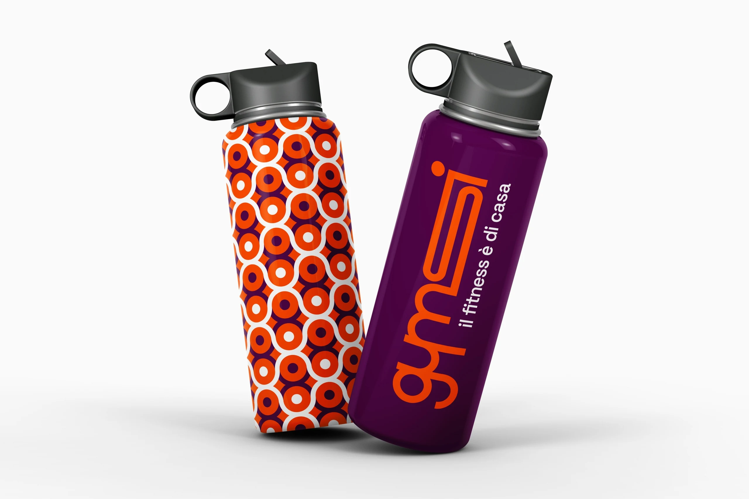
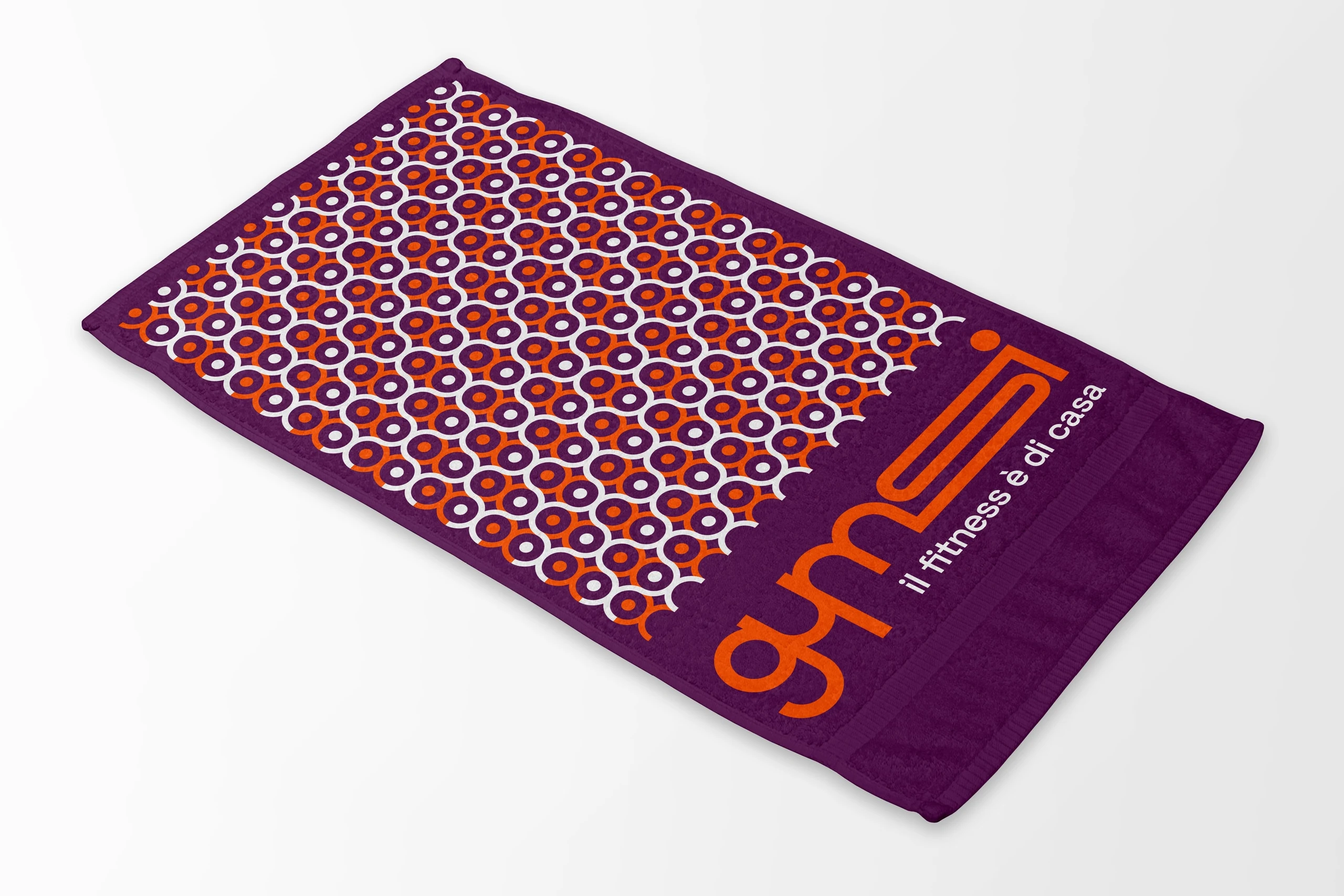
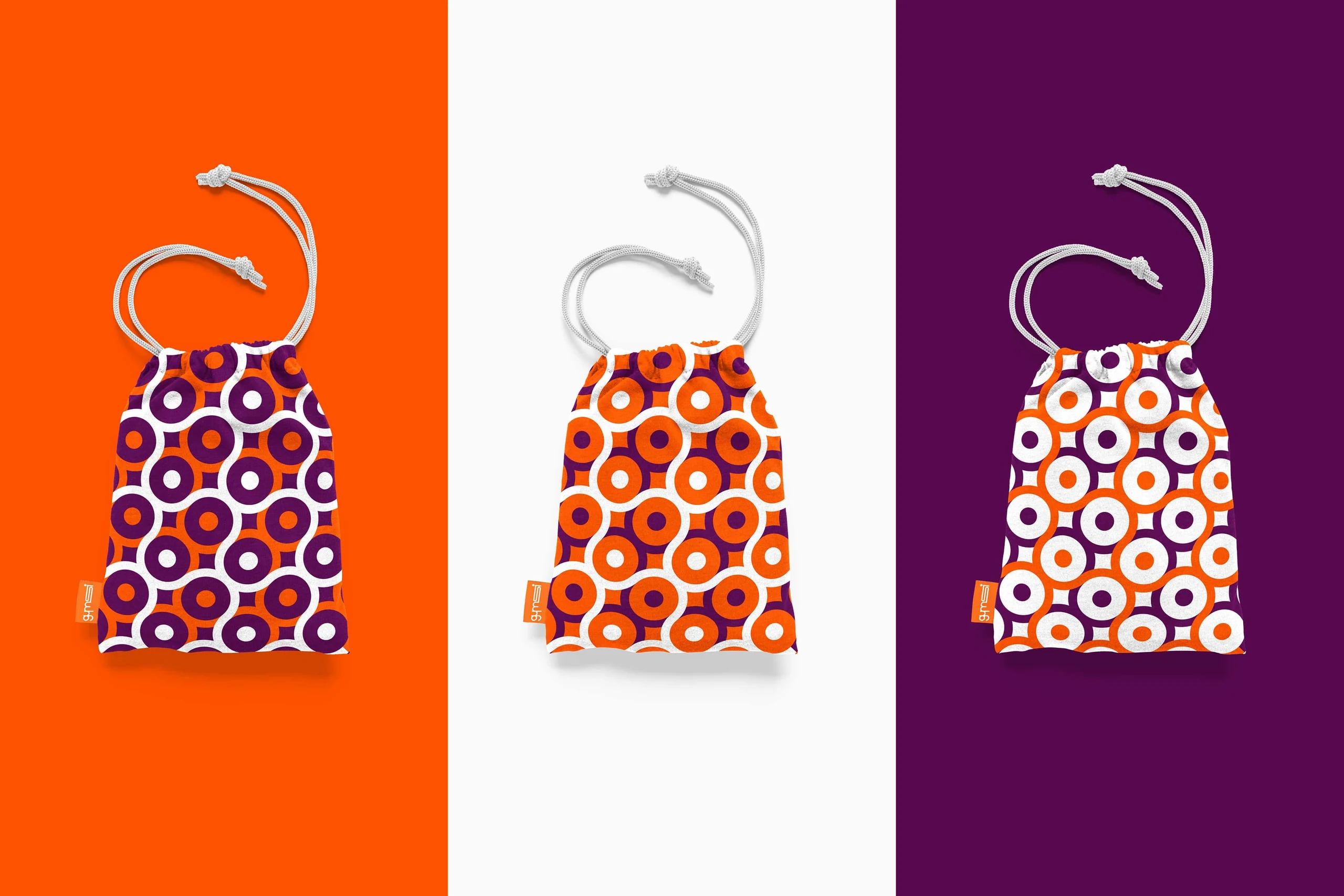
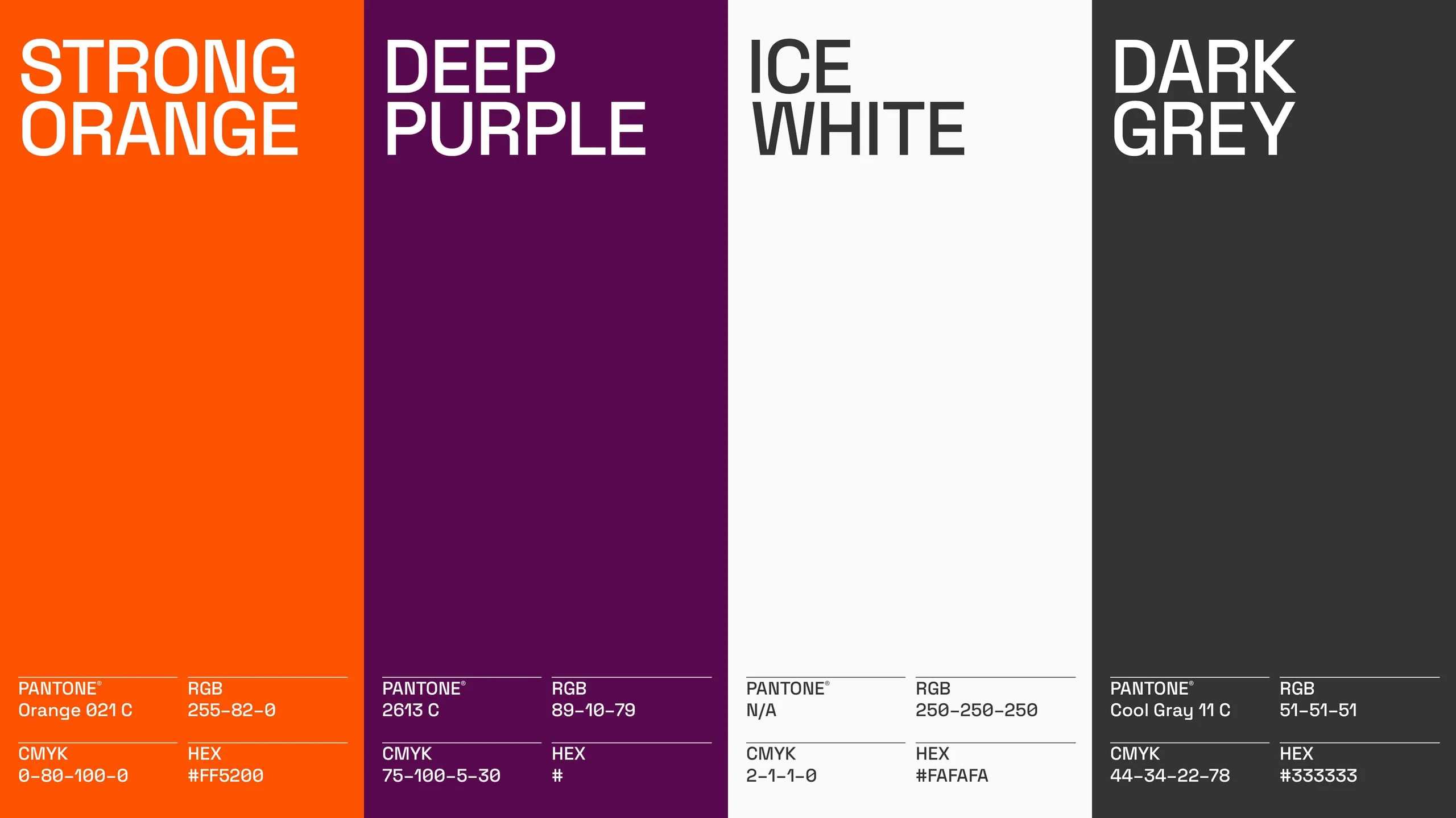
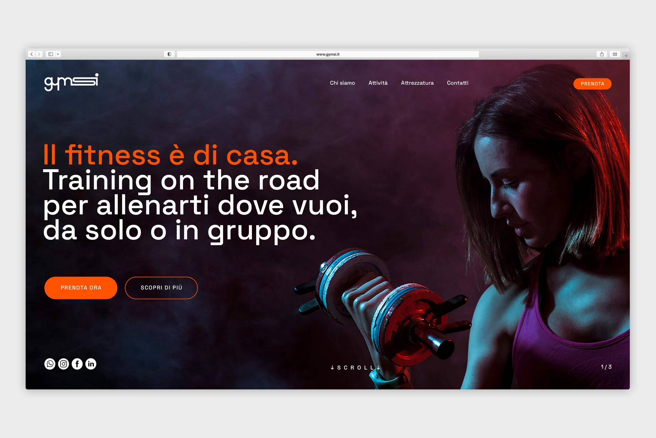
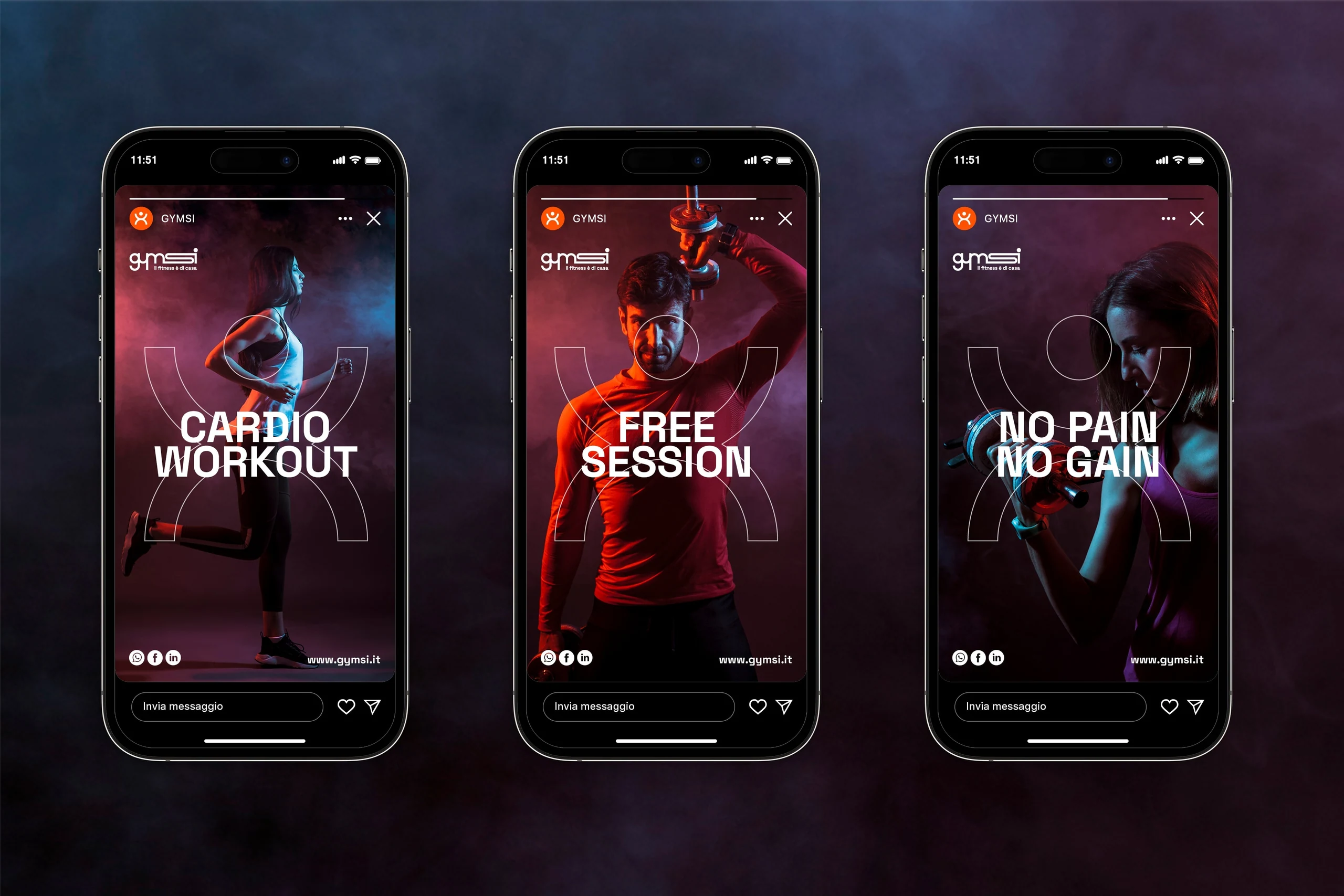
The logotype resolves into an essential mark, its elongated "S" becoming the brand's defining trait. Built from the intersection of two inverted semicircles, the icon reads as a dynamic symbol, instantly recognisable. A deliberately informal tone of voice runs alongside the visual system, matching the brand's youthful personality. The palette developed for Gymsi is energetic, dynamic and vibrant, and extends into the photographic style: contrasting tones and bold colours that carry the identity's consistency through to its digital presence.
Impact
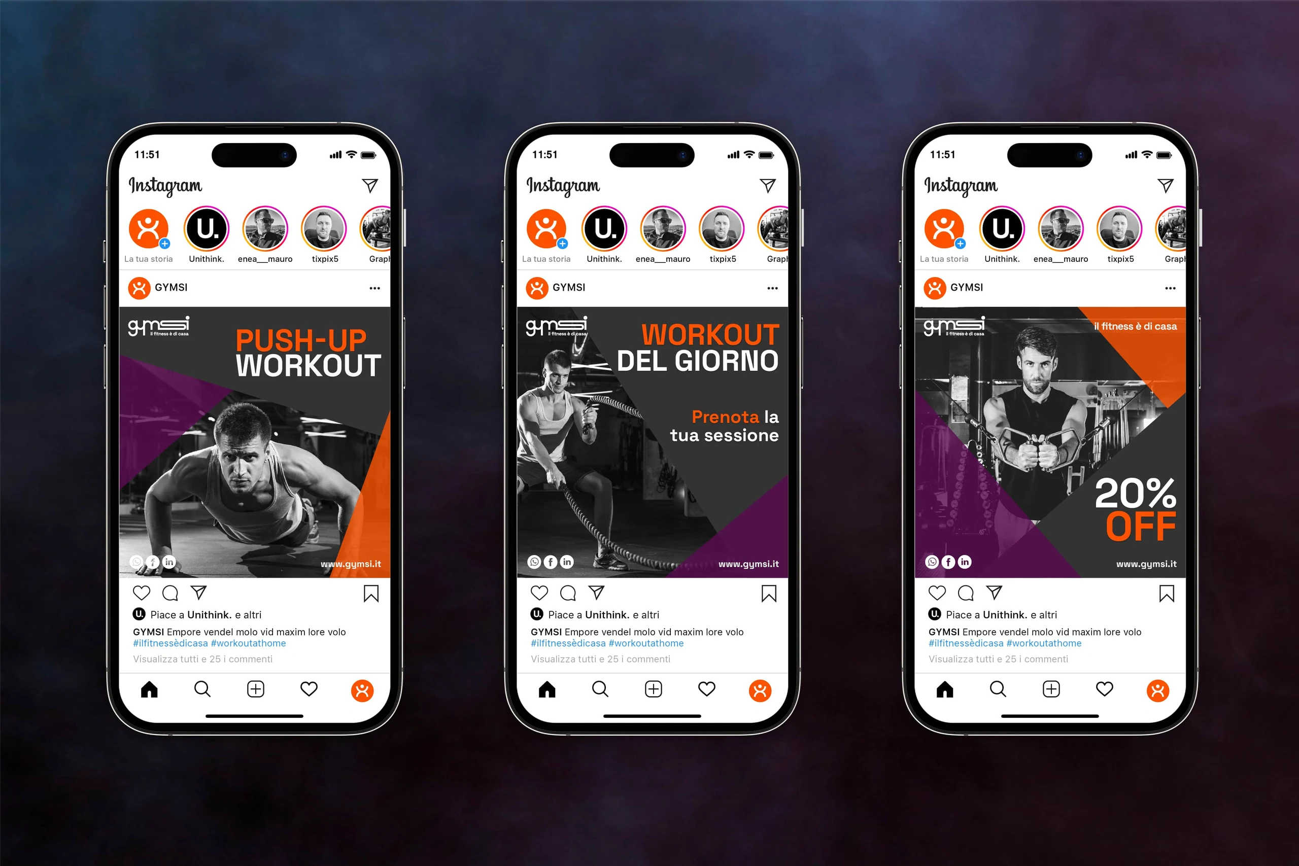
The identity strengthens Gymsi's standing as a young, approachable brand, setting it apart in the fitness market precisely through its most disruptive offer: bringing training to people's doorstep. Consistency across logotype, icon, tone of voice and art direction makes the brand instantly recognisable at every touchpoint — from the equipped vans to digital communication — building trust in a service that breaks with the traditional idea of the gym.