The heart of wood.
Client
Effedi
Work
Corporate Identity
Services
- Creative Direction
- Art Direction
- Photography
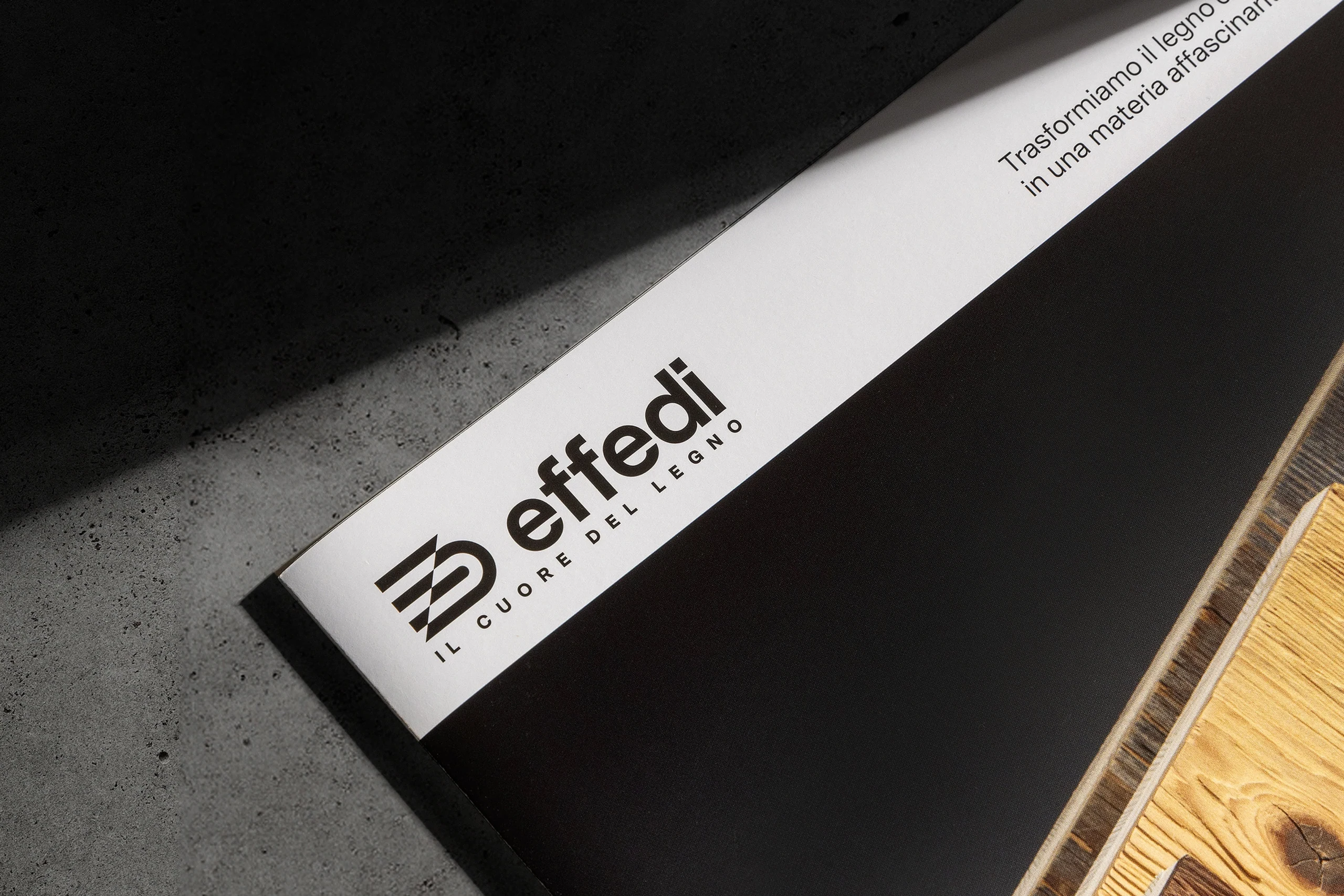
- Logo Design
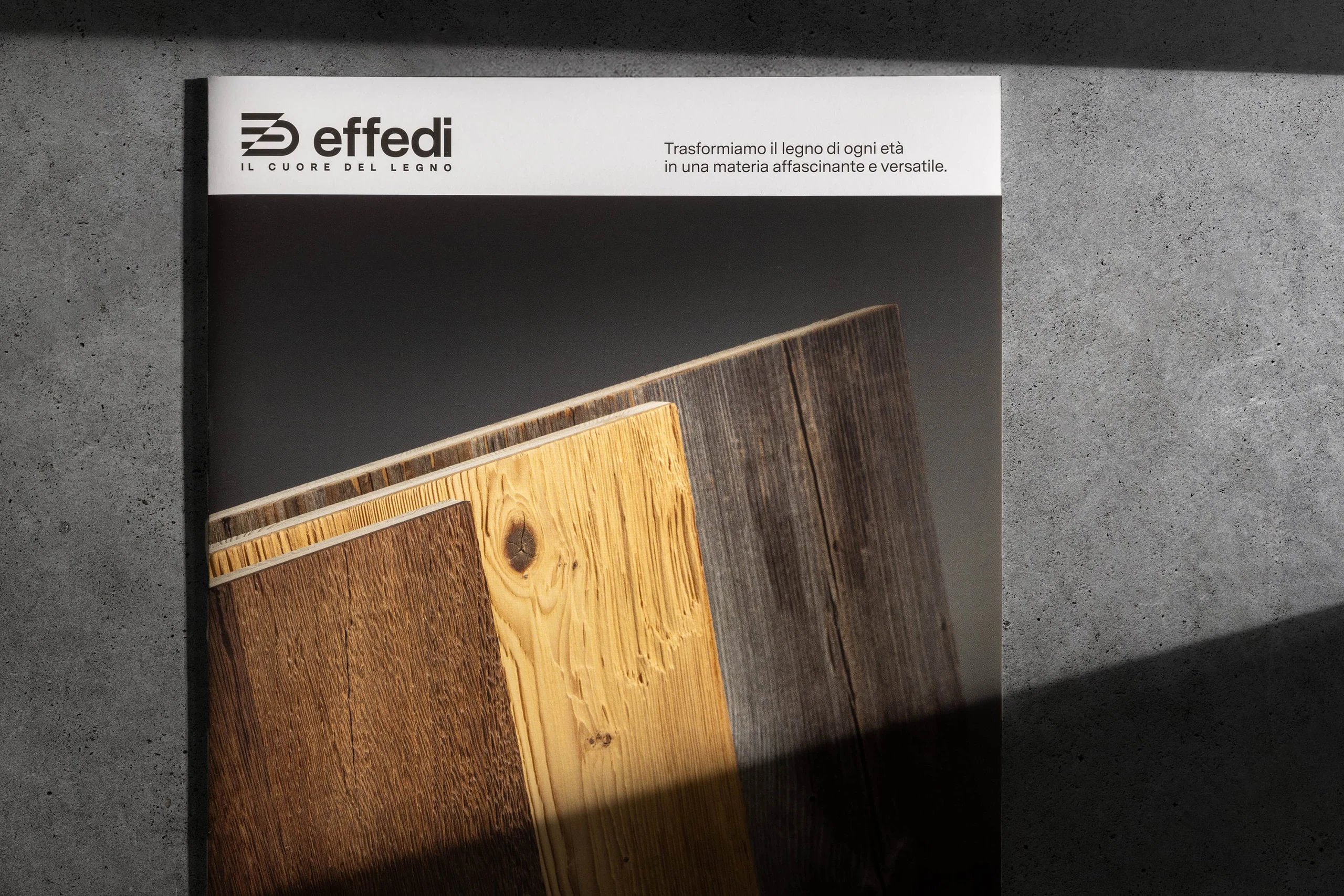
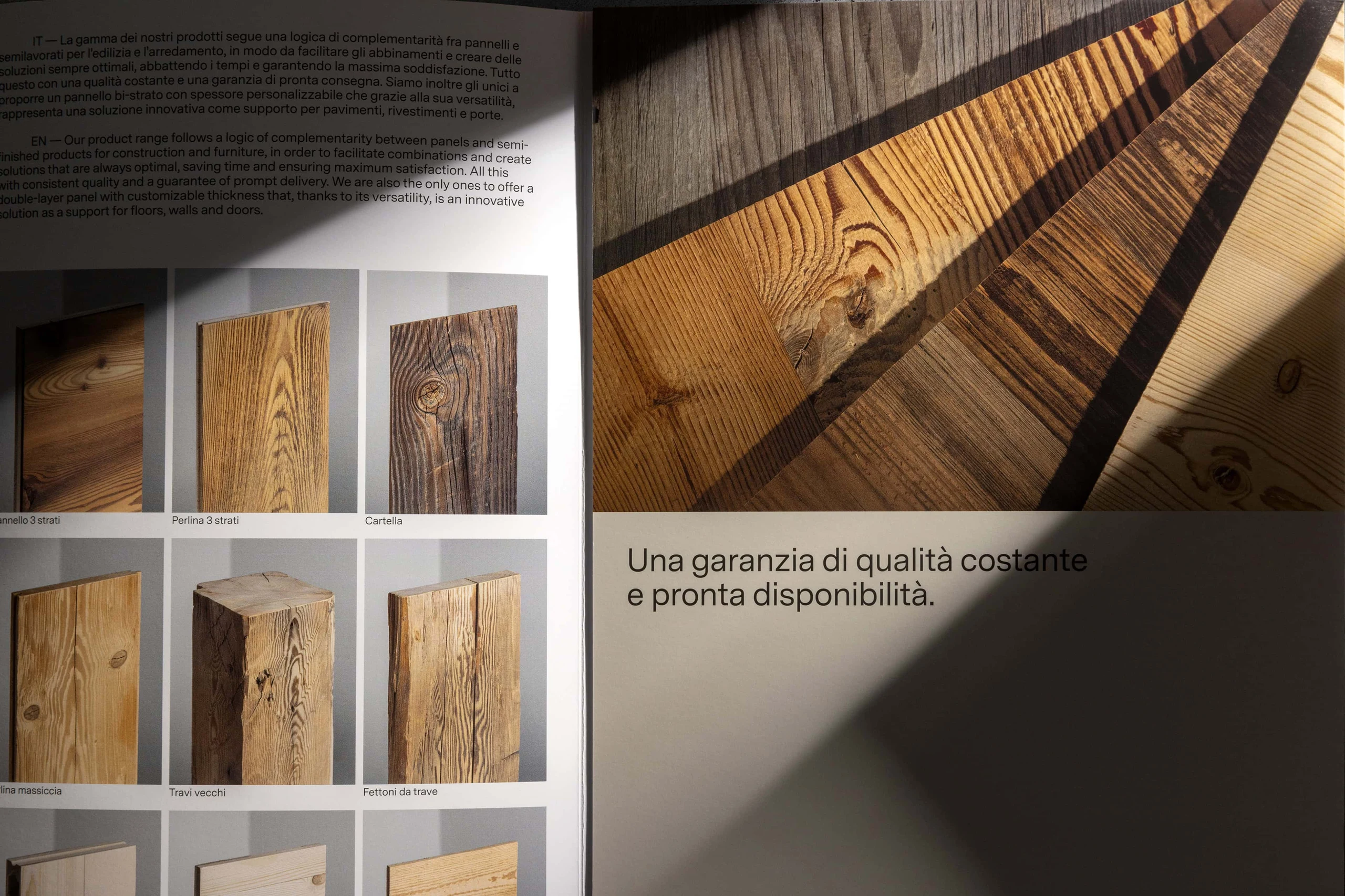
- Editorial Design
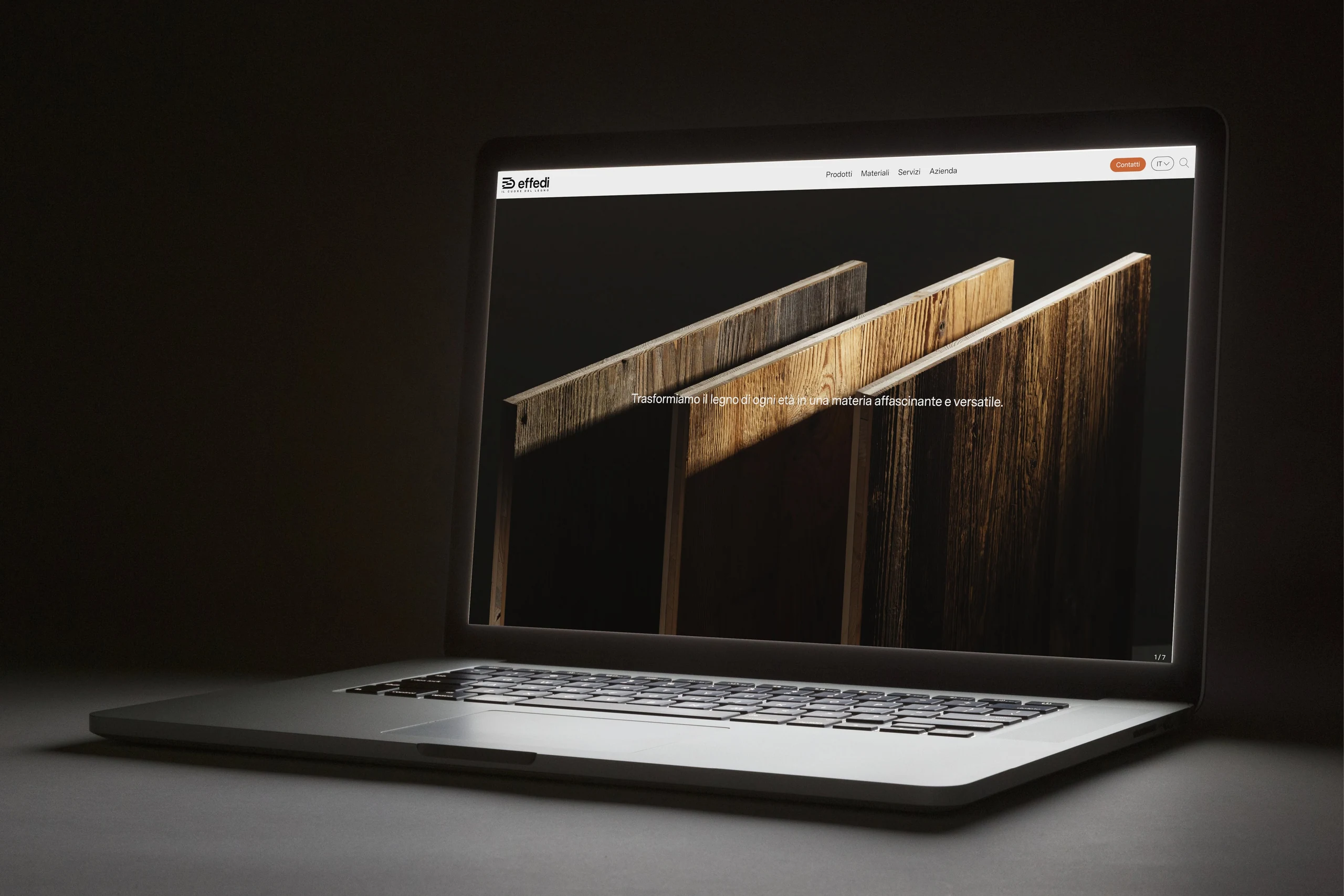
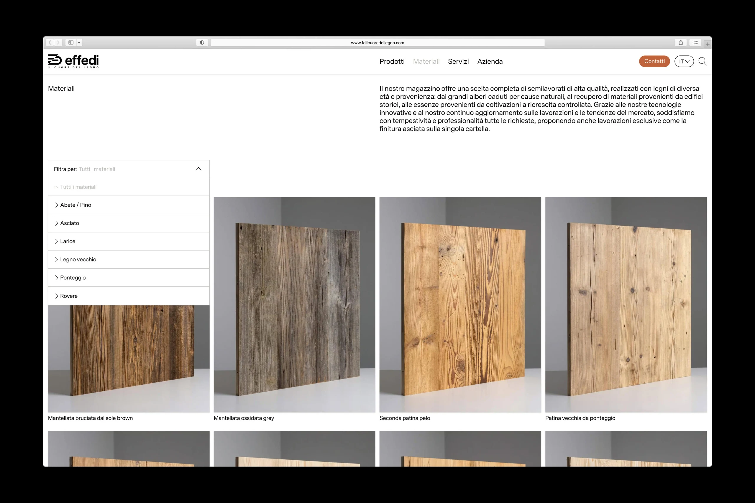
- Web Design
- Image Production
Challenge
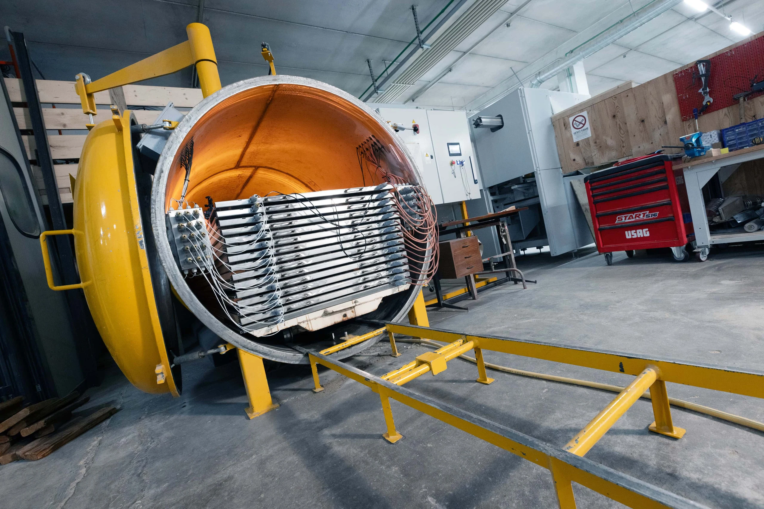
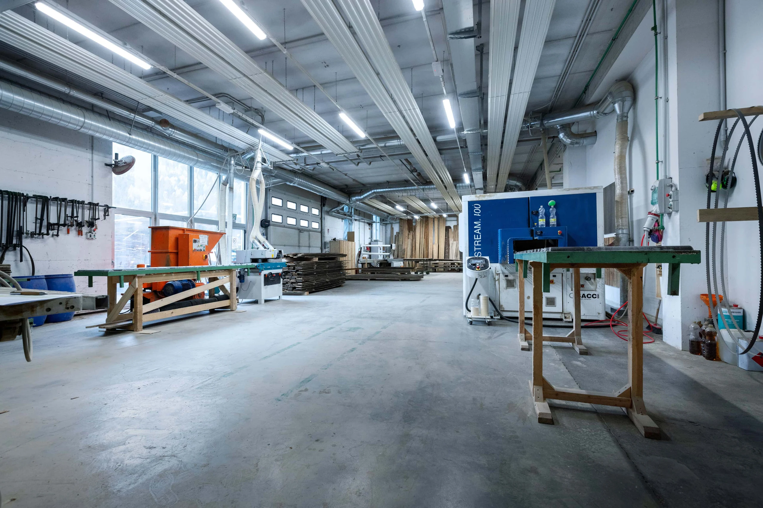
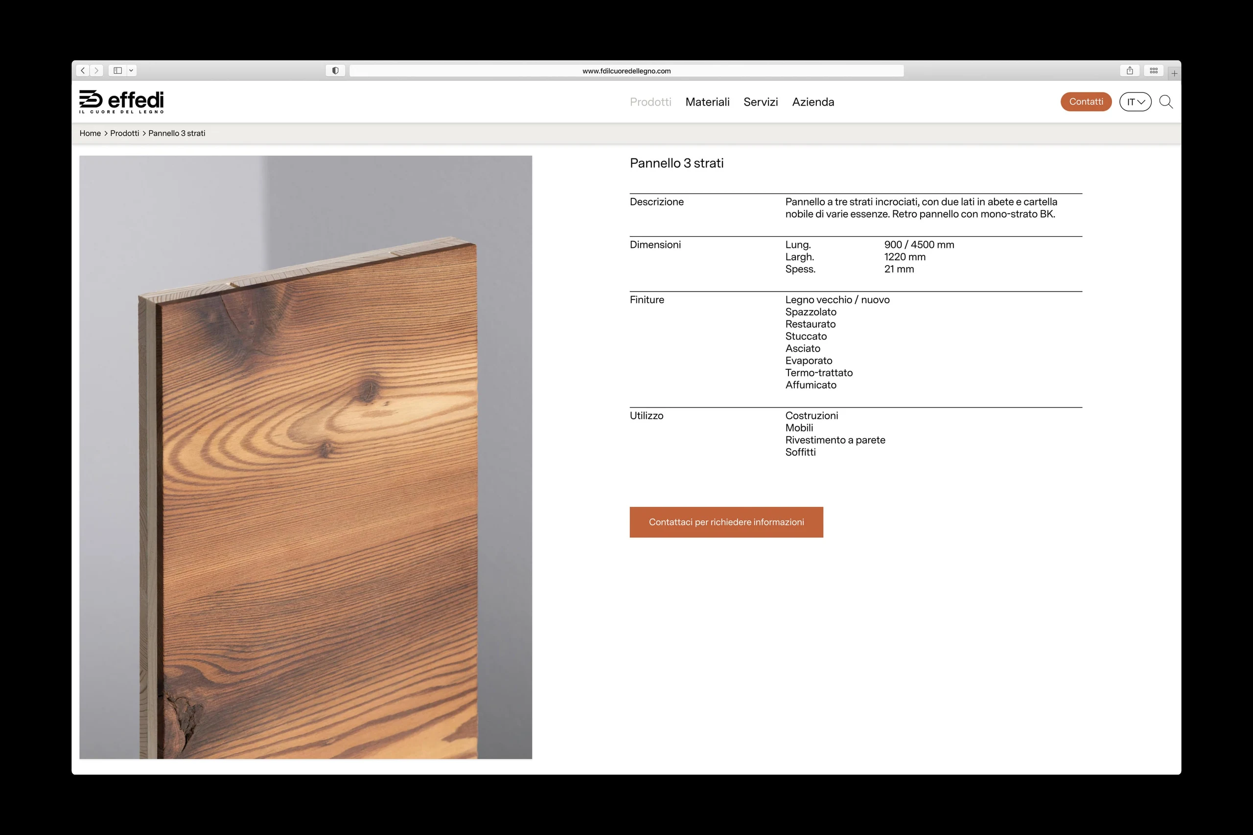
Effedi specializes in woodworking, supplying ready-to-use products to building and furnishing professionals. As the company set out to grow from a local and regional footprint to a national and international one, its identity had to evolve with it. The artisanal image that had defined Effedi needed to give way to a more industrial positioning, one able to hold its own in a broader, more demanding market.
Thinking
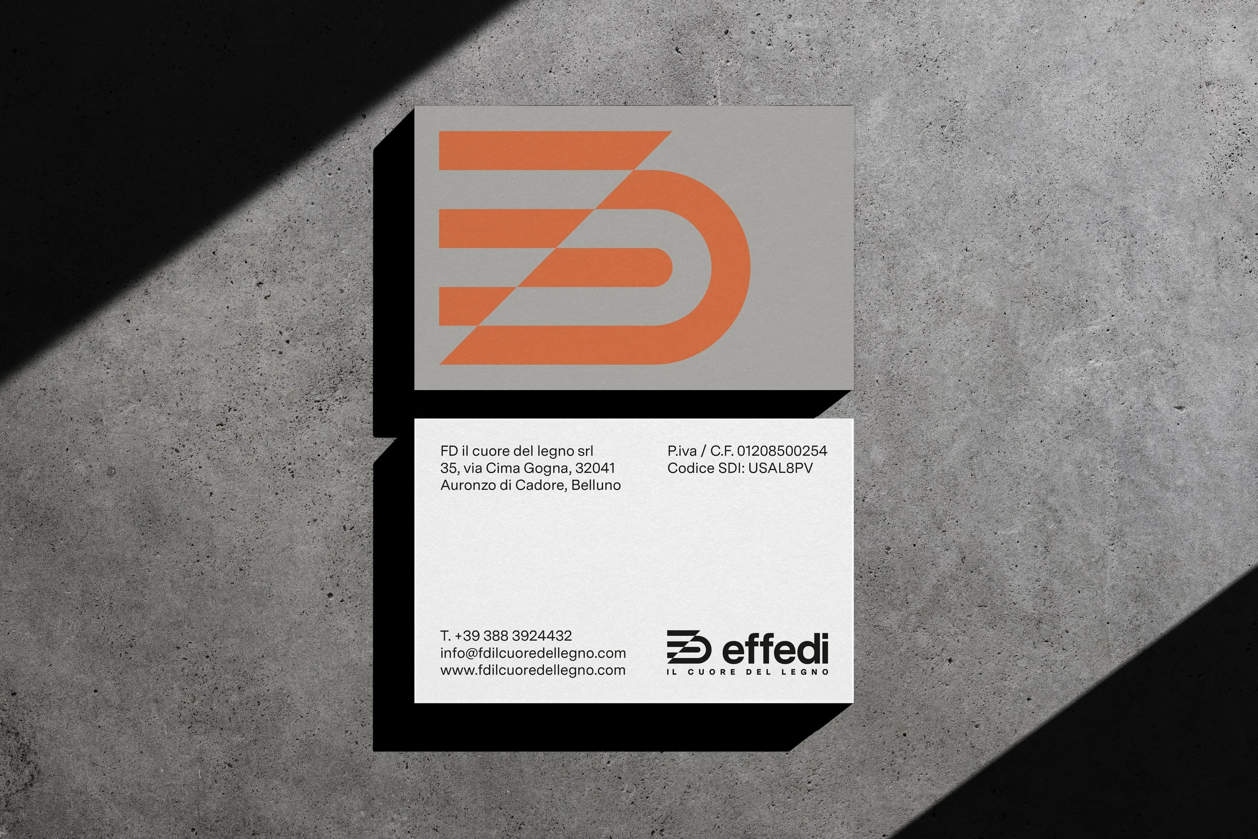
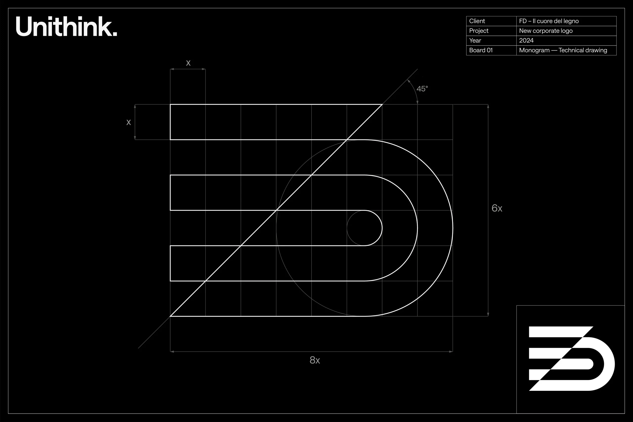
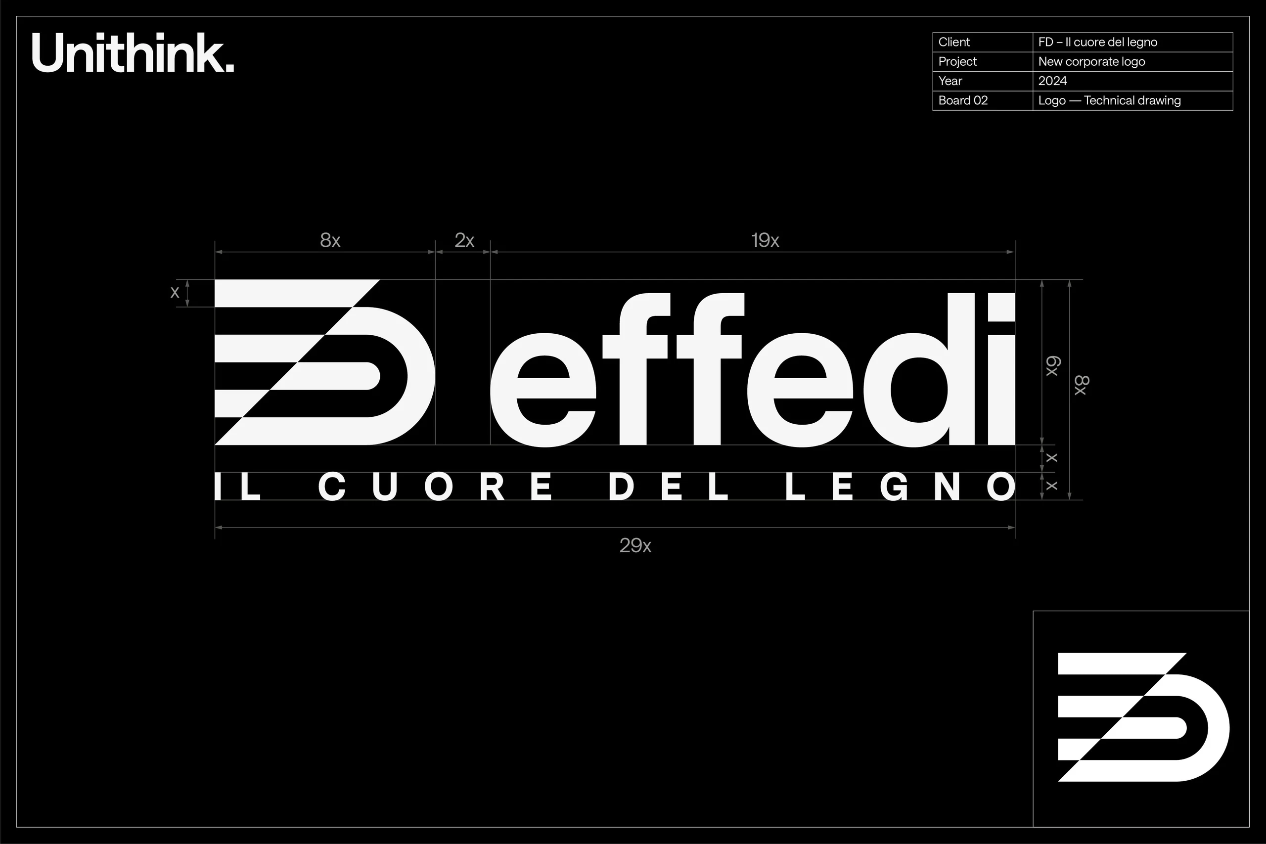
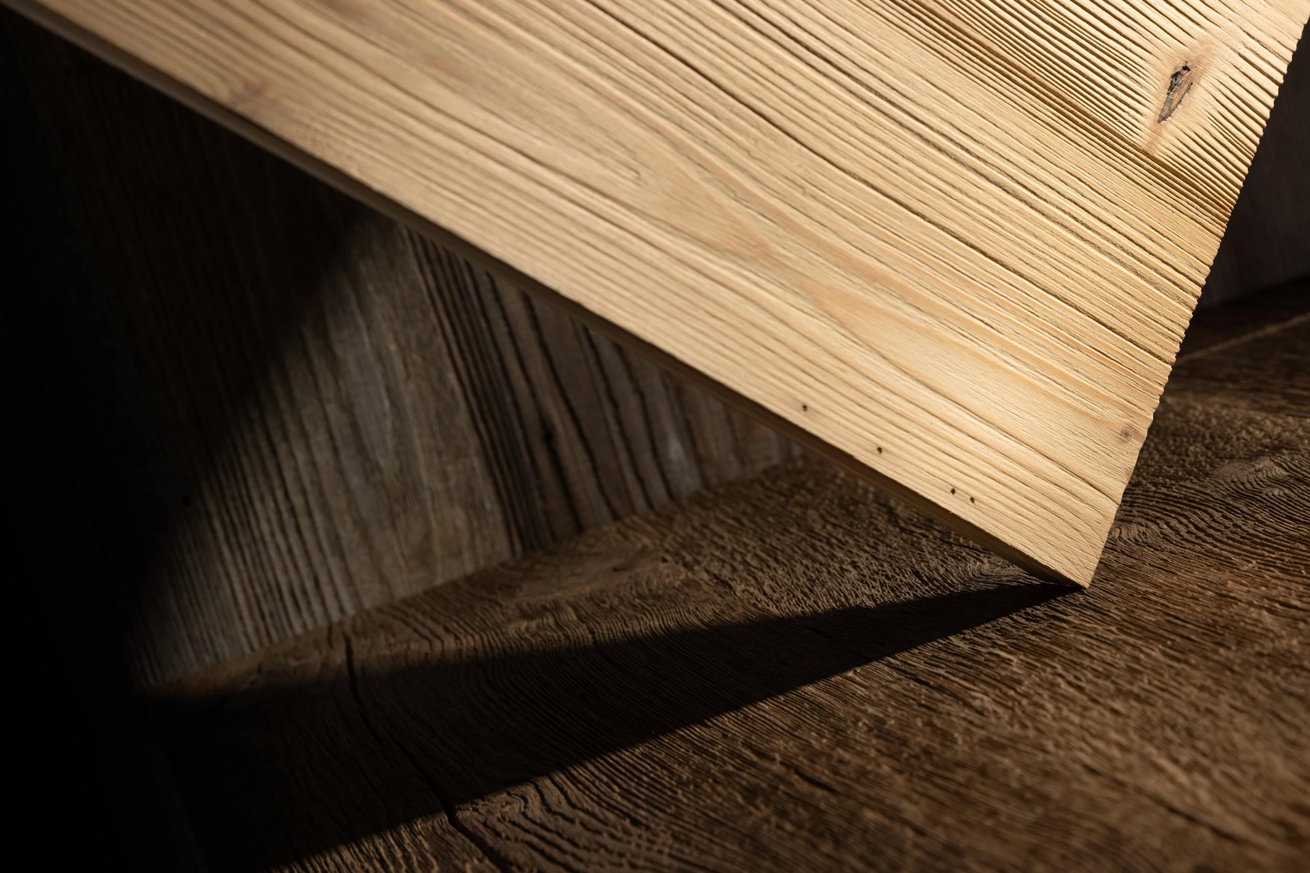
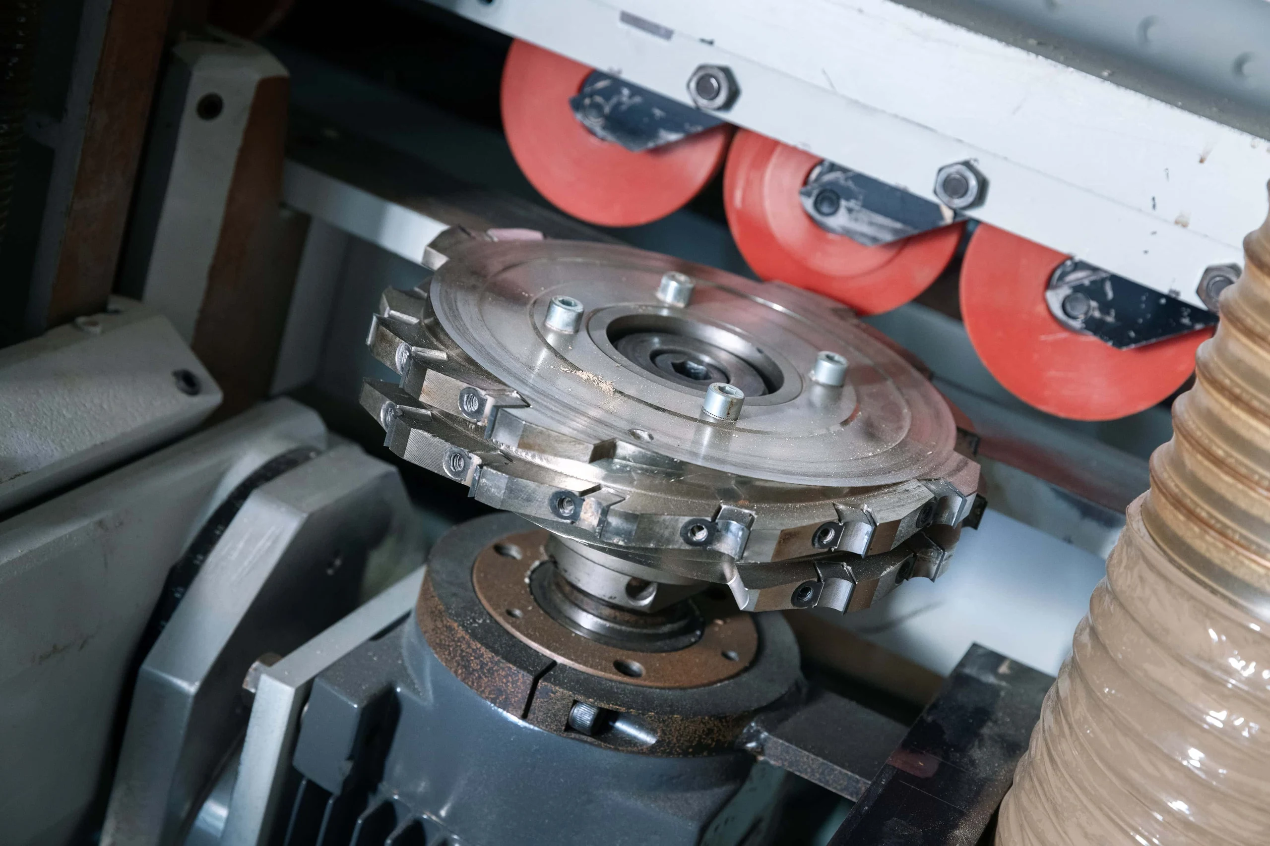
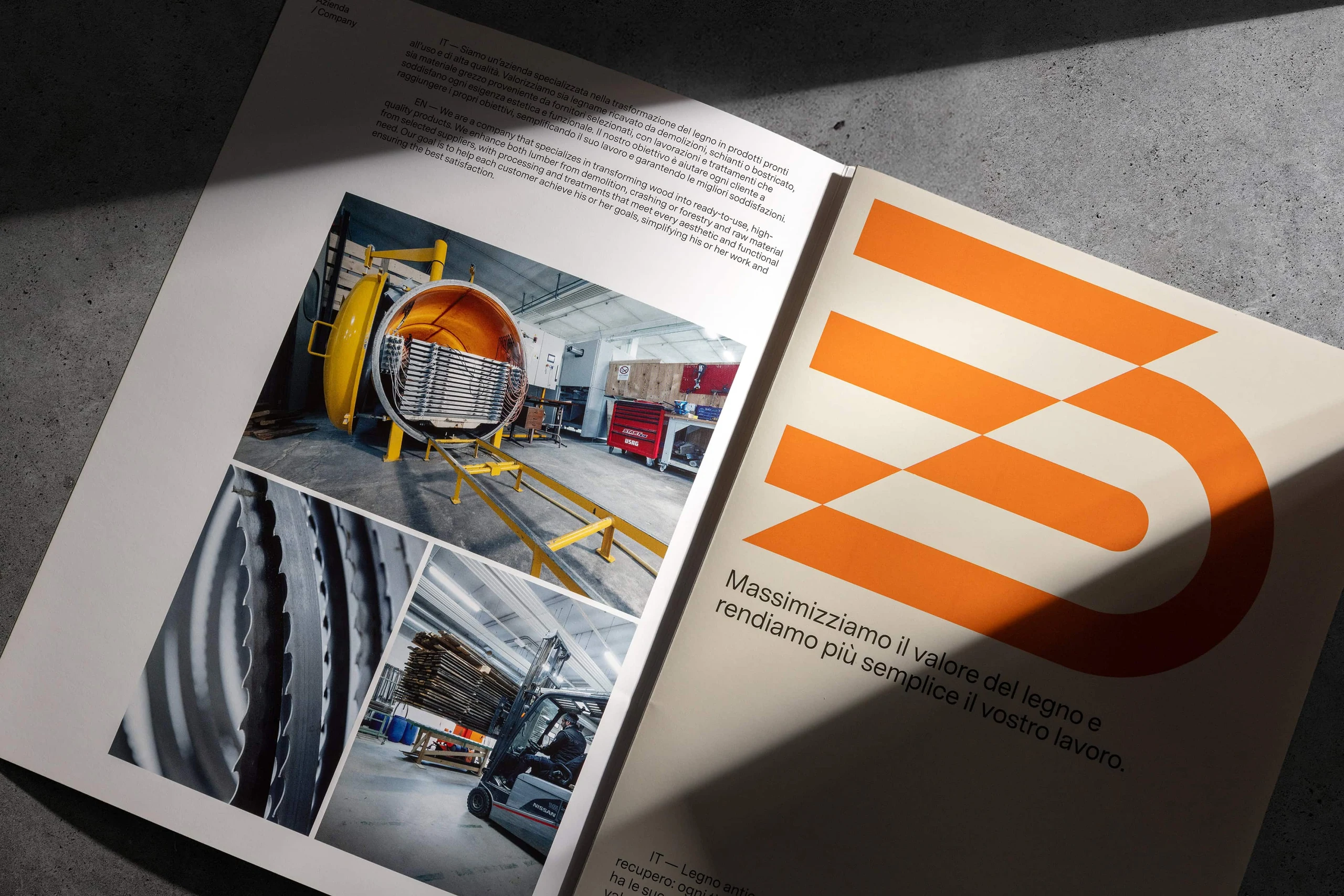
Linearity, the defining trait of Effedi's multilayer panels and its flagship product, guided the new visual identity. The logo takes its cue from a technical detail: the 45° cut of the joint, a mark of the precision and craftsmanship at the core of the company. From this detail emerges the abstract "FD" monogram, essential yet evocative. A sans serif typeface lends solidity and structure, qualities in step with Effedi's shift toward an industrial scale.
Outcome
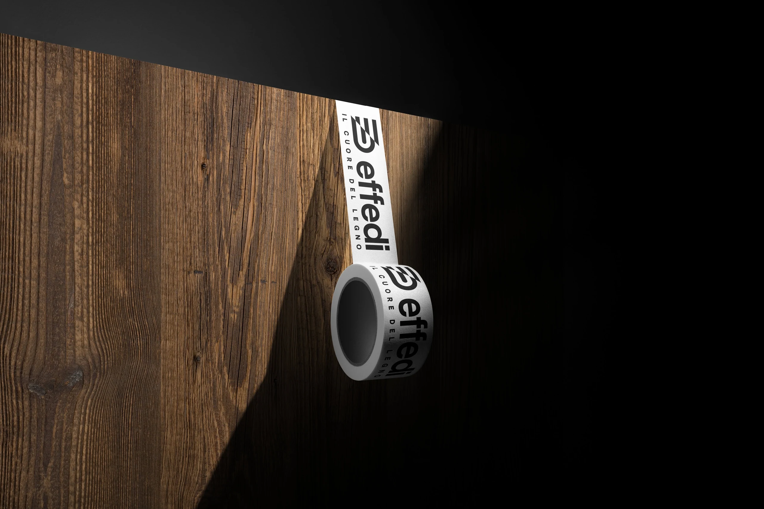
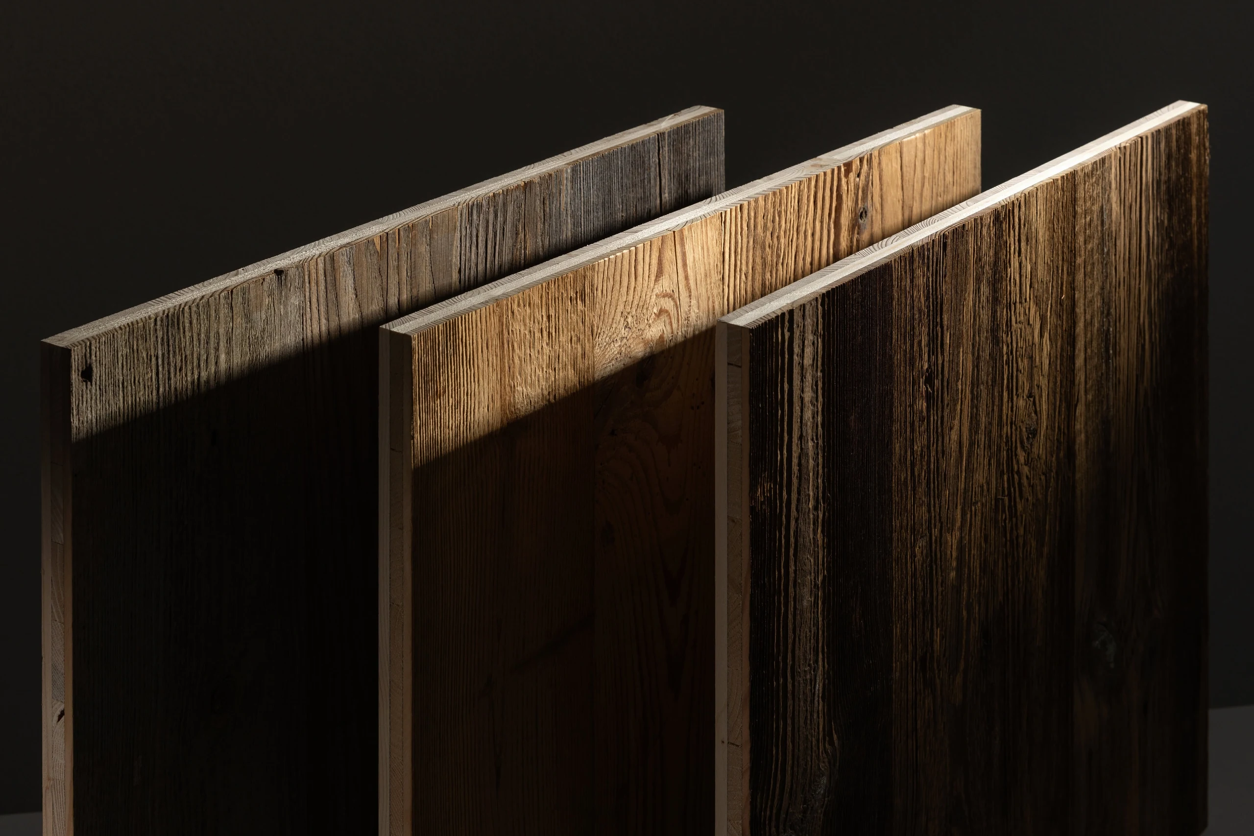
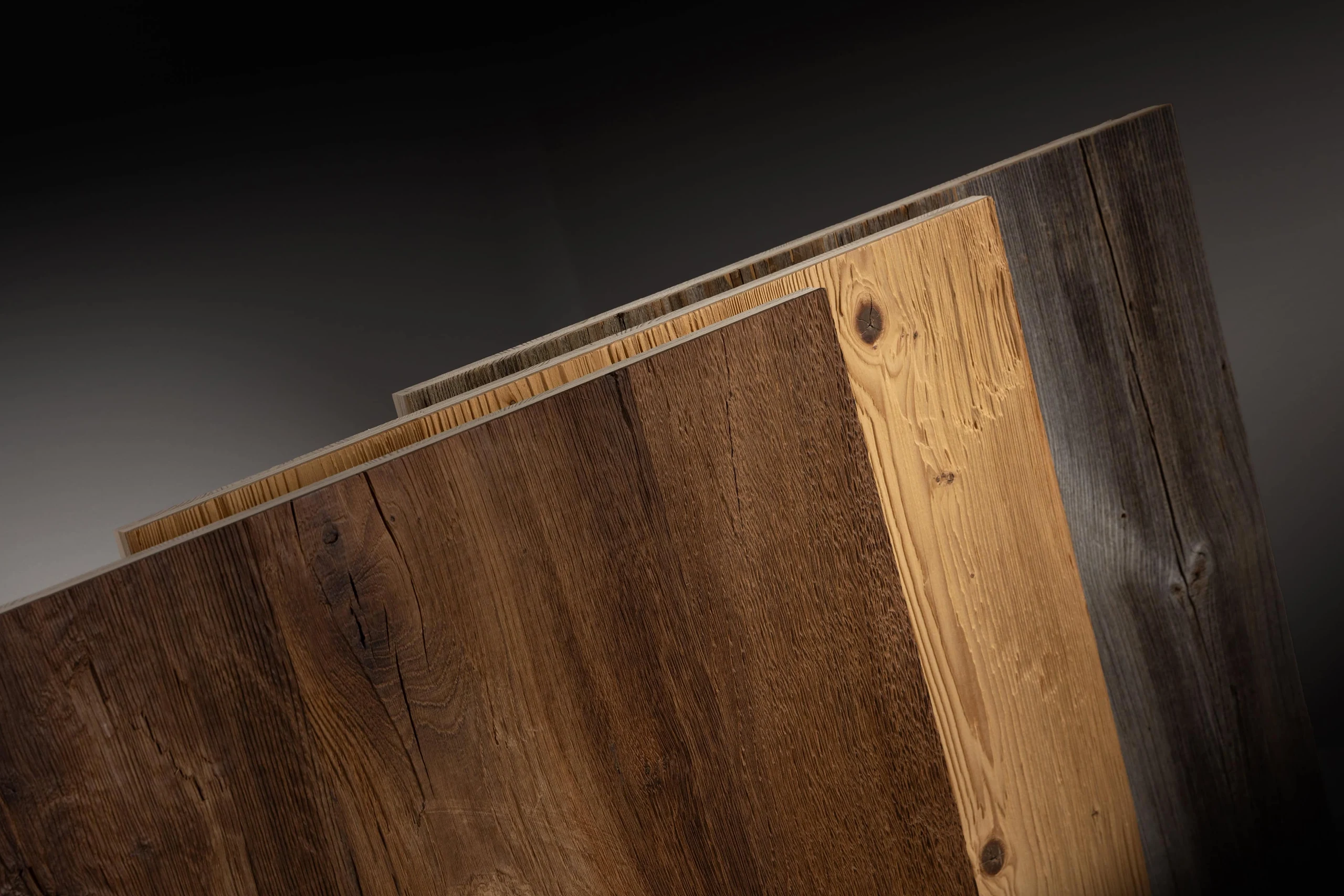
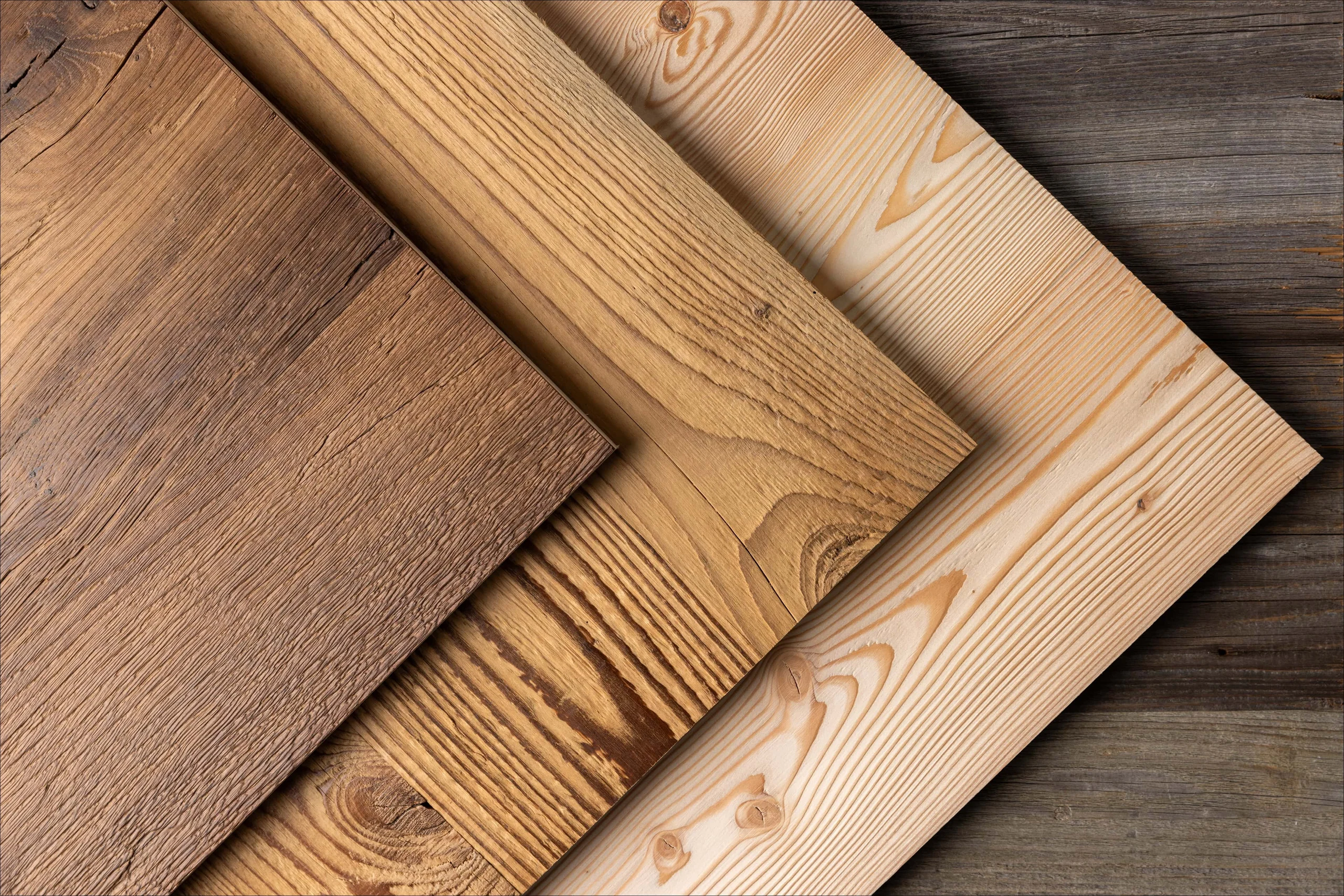
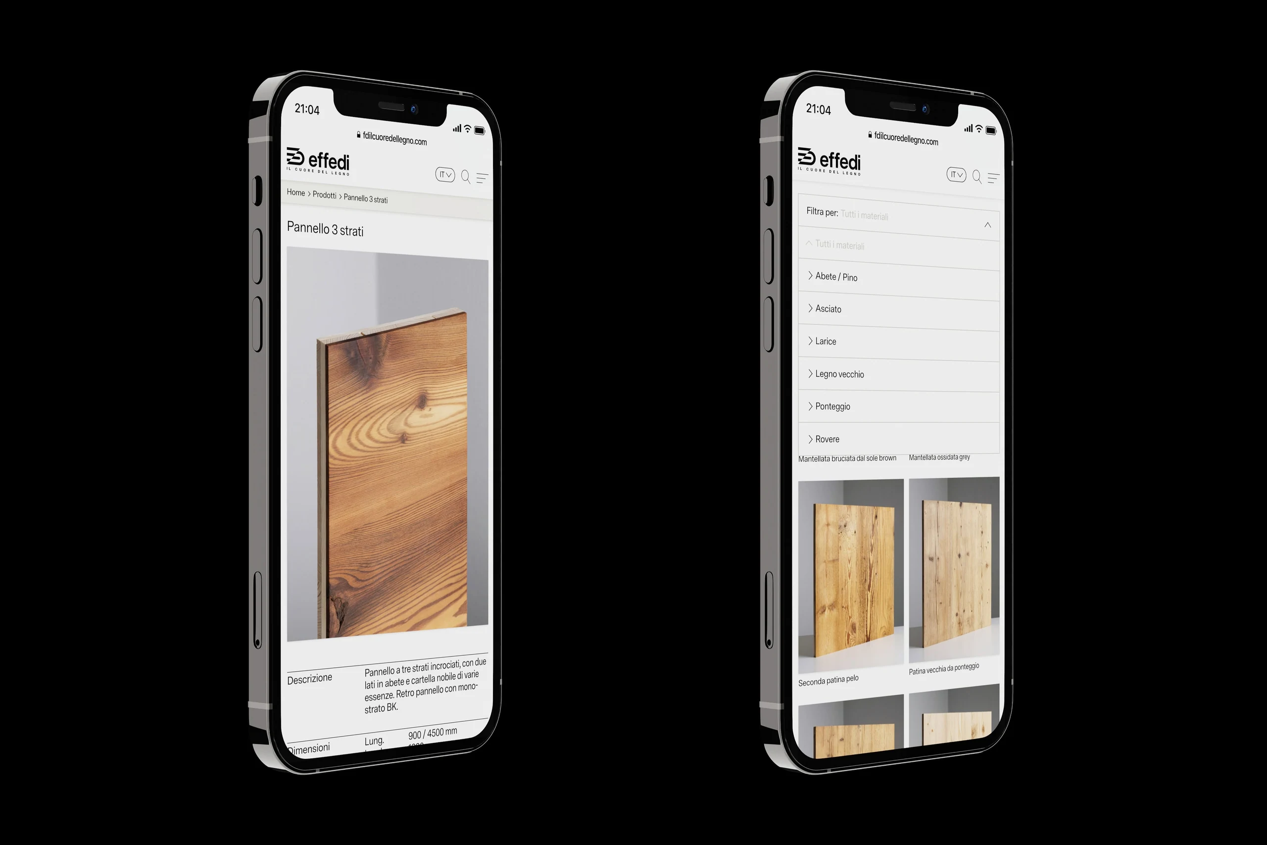
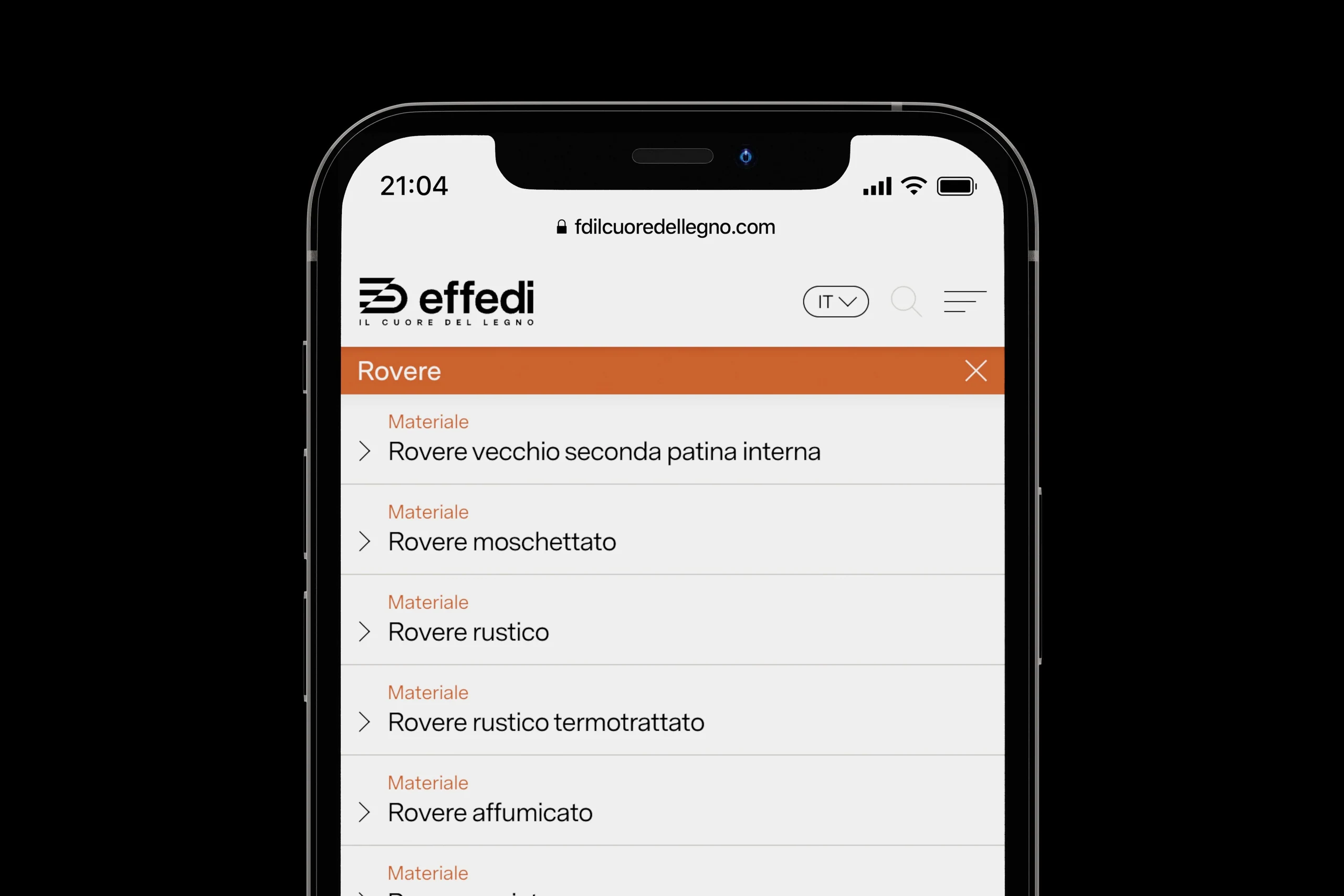
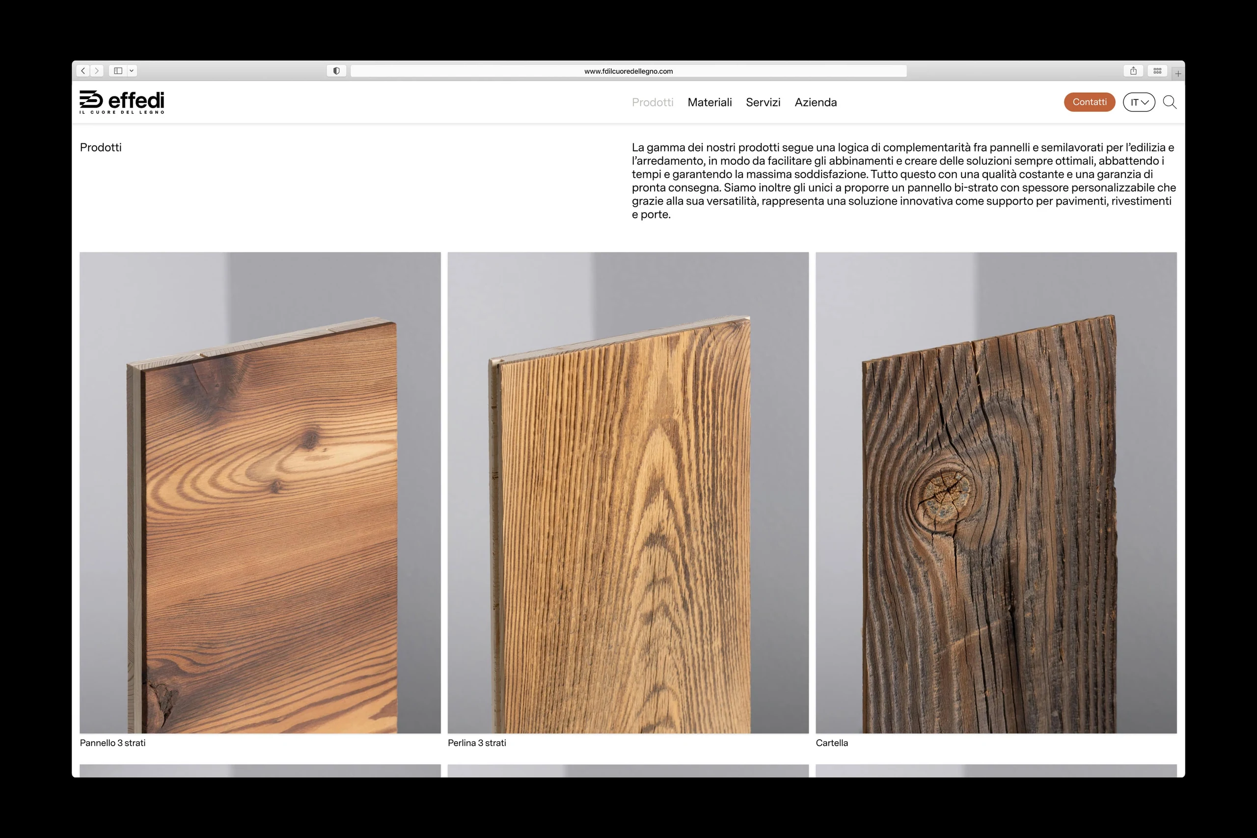
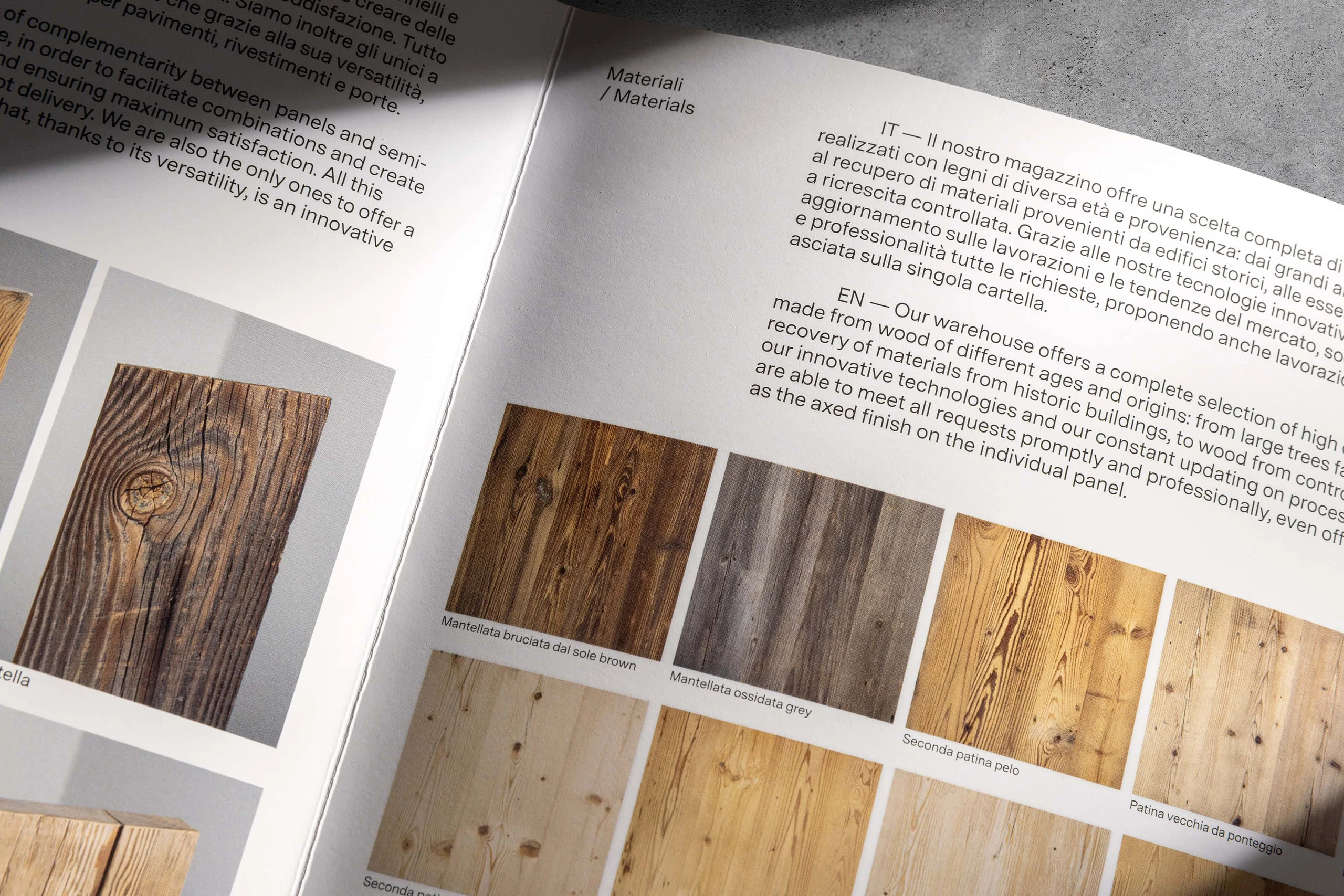
The identity is built on a minimalist approach of clean lines, order and rationality. It lets the brand speak clearly and leaves photography free to take center stage in how Effedi is perceived. The "FD" monogram becomes more than a symbol: it is the visual expression of a company evolving into a broader, more structured enterprise.
Impact
The new identity allows Effedi to enter national and international markets with the credibility of an industrial brand, moving beyond the perception of a local artisan business. Consistency across monogram, typography and photographic language strengthens its positioning. It gives building professionals, architects and commercial partners an image that is solid, recognizable and aligned with the brand's growth ambitions.